호반아트리움은 호반문화재단이 운영하는 복합 문화예술 공간으로, 시민들의 일상 속에 예술적 경험을 불어넣는 전시관입니다. 기존 아이덴티티는 단순하고 평범해 공간의 성격과 비전을 충분히 담아내지 못했습니다. 이번 리브랜딩은 “일상 속에서 예술을 마주하는 관문”을 새롭게 구축하는 데서 출발했습니다.
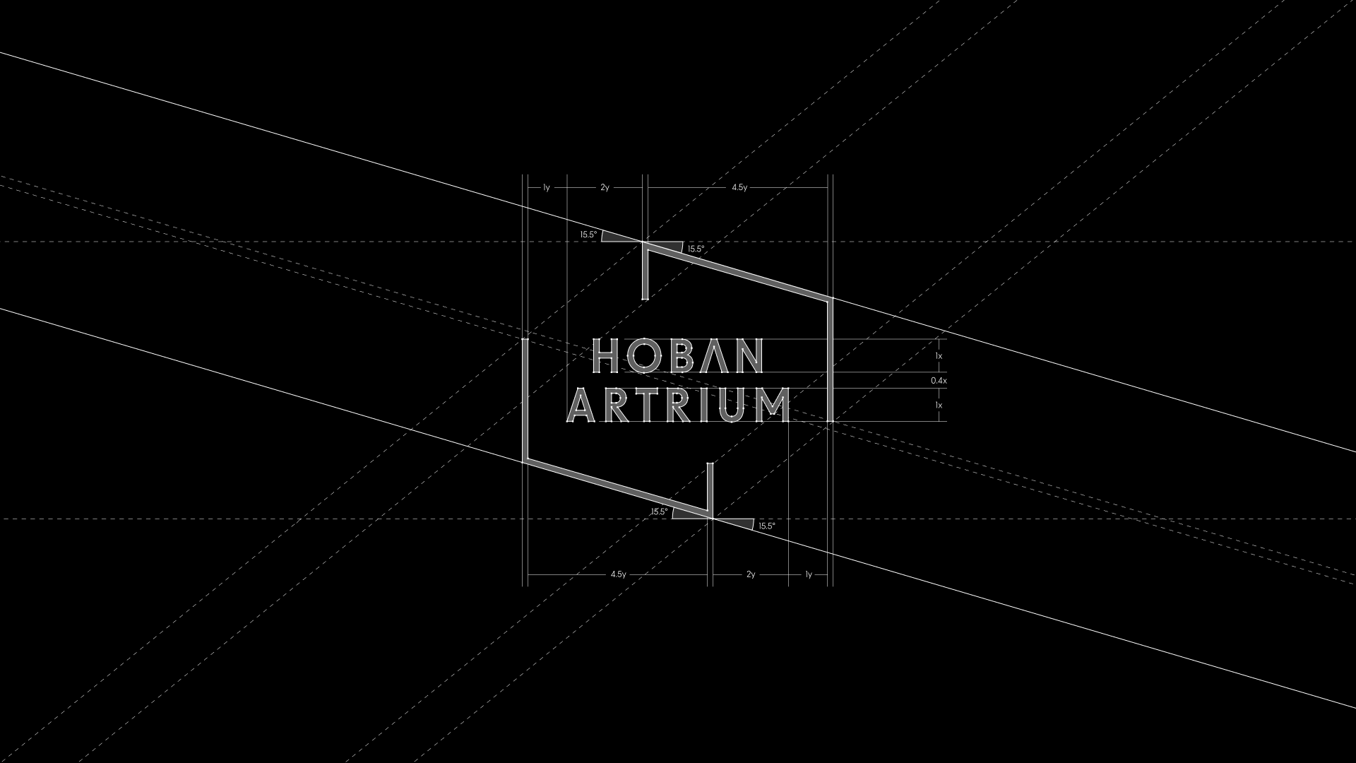
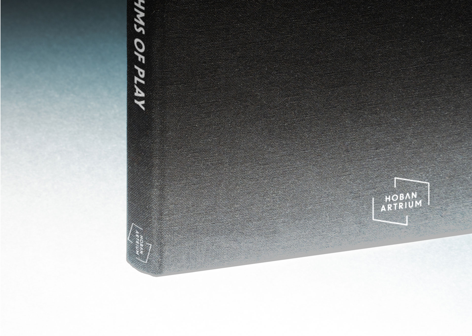
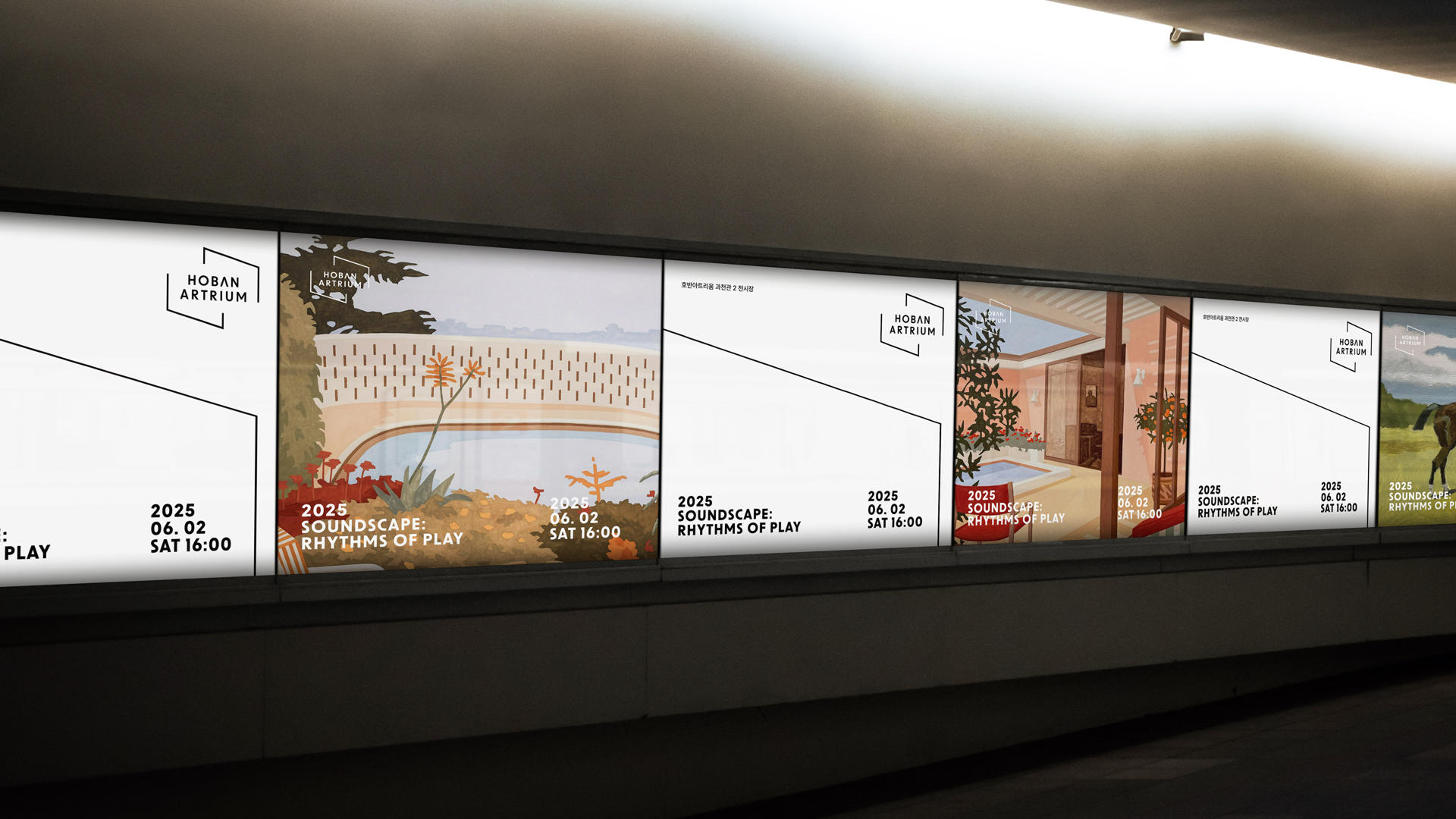
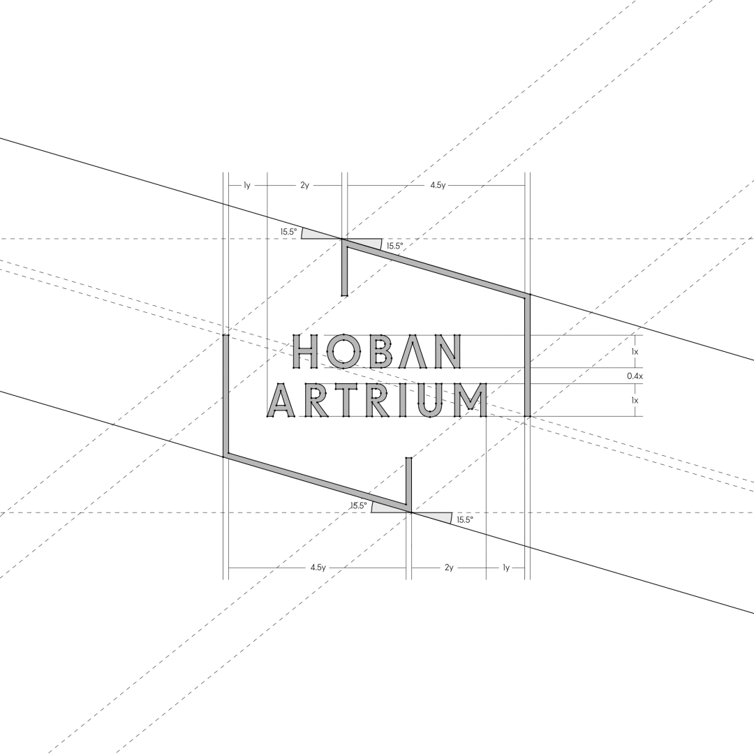
새로운 아이덴티티의 중심은 프레임(Frame)입니다. 이 프레임은 단순한 장식이 아니라, 일상과 예술을 구분 짓는 동시에 이어주는 경계이자 창으로 작동합니다. 열린 구조로 설계된 선은 닫히지 않고 유연하게 변주되며, 호반아트리움에서 펼쳐지는 다채로운 전시와 문화 활동을 담아내는 매개체가 됩니다.
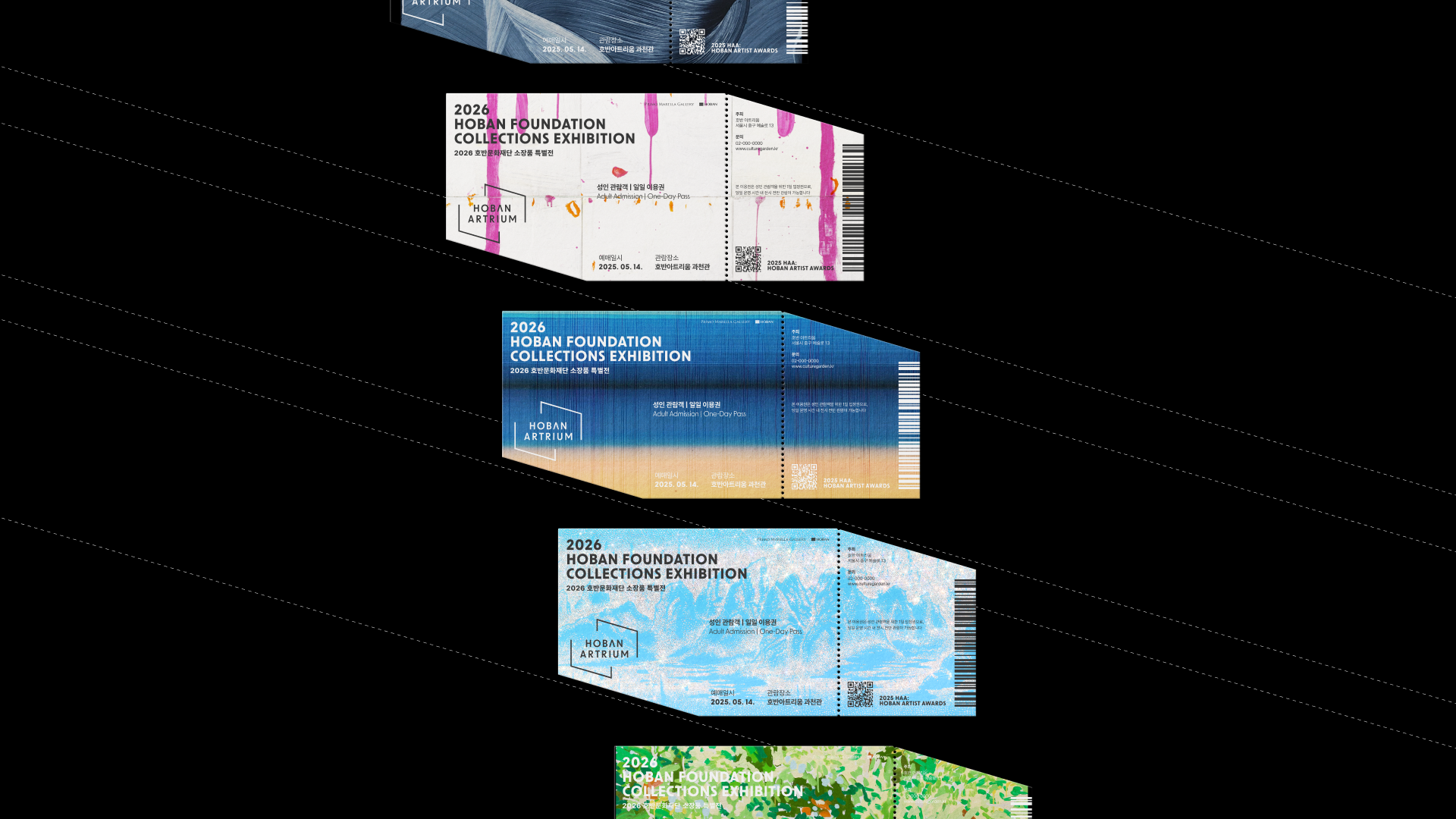
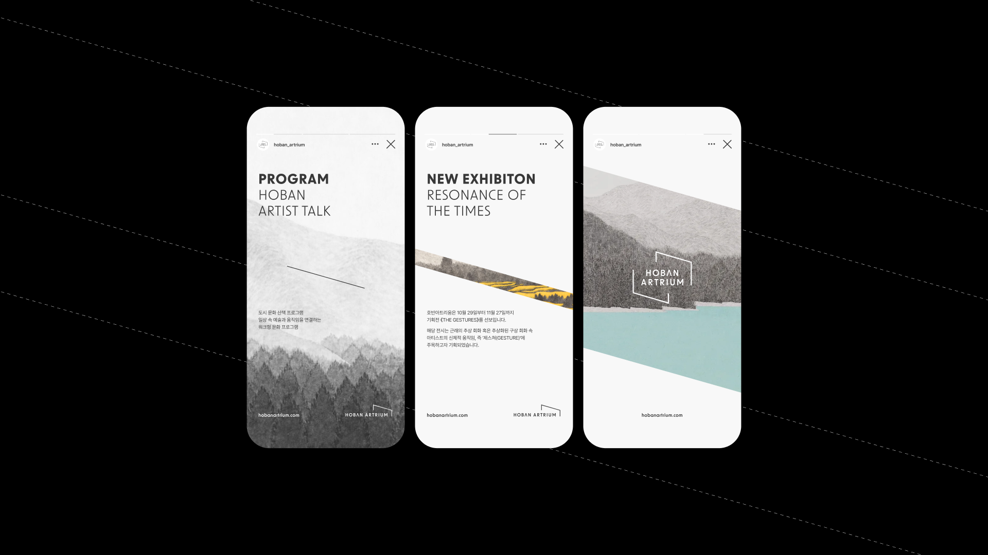
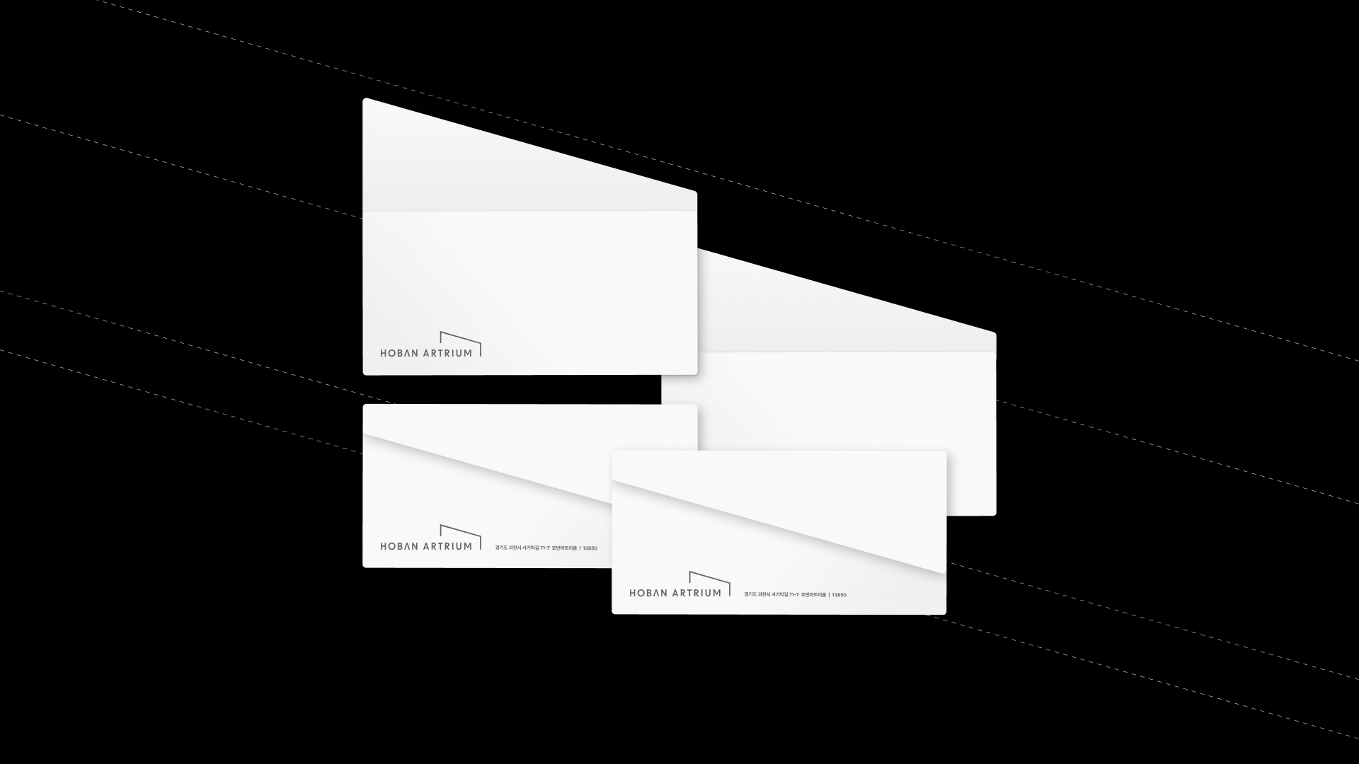
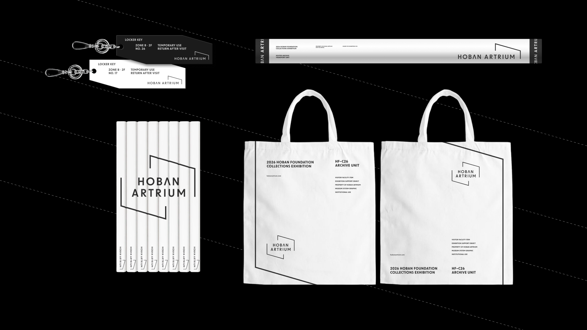
디자인 요소 또한 이 철학을 구체화합니다. 간결한 산세리프 서체는 현대적이고 공공적인 신뢰감을 부여하며, 화이트와 블랙의 대비는 예술의 생동감과 스펙트럼을 상징합니다. 프레임 모티프는 사인, 포스터, 온라인 콘텐츠 등 다양한 매체로 확장되어 호반아트리움만의 시각 언어를 완성합니다.
과천점 개관과 함께 구축된 이번 리브랜딩은 호반아트리움을 단순한 전시관을 넘어, 도시 속 누구나 예술을 마주할 수 있는 열린 복합예술문화 플랫폼으로 재정의하는 과정이었습니다.
Hoban Atrium, operated by the Hoban Cultural Foundation, is a cultural and art complex designed to bring artistic experiences into daily life. The previous identity was too simple to fully convey its vision. The rebranding began with the concept of creating “a gateway to art in everyday life.”
At its core lies the Frame, not as decoration but as a boundary and window connecting daily life with art. Designed with open and flexible lines, the frame adapts to diverse exhibitions and cultural activities within the space.
Minimal sans-serif typography conveys modernity and trust, while the black-and-white contrast symbolizes vibrancy and the spectrum of art. The frame motif expands across signage, posters, and digital media, forming Hoban Atrium’s distinct visual language.
Launched alongside the Gwacheon opening, this rebranding redefines Hoban Atrium as an open cultural platform where everyone can encounter art beyond the confines of a gallery.
호반아트리움은 호반문화재단이 운영하는 복합 문화예술 공간으로, 시민들의 일상 속에 예술적 경험을 불어넣는 전시관입니다. 기존 아이덴티티는 단순하고 평범해 공간의 성격과 비전을 충분히 담아내지 못했습니다. 이번 리브랜딩은 “일상 속에서 예술을 마주하는 관문”을 새롭게 구축하는 데서 출발했습니다.
새로운 아이덴티티의 중심은 프레임(Frame)입니다. 이 프레임은 단순한 장식이 아니라, 일상과 예술을 구분 짓는 동시에 이어주는 경계이자 창으로 작동합니다. 열린 구조로 설계된 선은 닫히지 않고 유연하게 변주되며, 호반아트리움에서 펼쳐지는 다채로운 전시와 문화 활동을 담아내는 매개체가 됩니다.
디자인 요소 또한 이 철학을 구체화합니다. 간결한 산세리프 서체는 현대적이고 공공적인 신뢰감을 부여하며, 화이트와 블랙의 대비는 예술의 생동감과 스펙트럼을 상징합니다. 프레임 모티프는 사인, 포스터, 온라인 콘텐츠 등 다양한 매체로 확장되어 호반아트리움만의 시각 언어를 완성합니다.
과천점 개관과 함께 구축된 이번 리브랜딩은 호반아트리움을 단순한 전시관을 넘어, 도시 속 누구나 예술을 마주할 수 있는 열린 복합예술문화 플랫폼으로 재정의하는 과정이었습니다.
Hoban Atrium, operated by the Hoban Cultural Foundation, is a cultural and art complex designed to bring artistic experiences into daily life. The previous identity was too simple to fully convey its vision. The rebranding began with the concept of creating “a gateway to art in everyday life.”
At its core lies the Frame, not as decoration but as a boundary and window connecting daily life with art. Designed with open and flexible lines, the frame adapts to diverse exhibitions and cultural activities within the space.
Minimal sans-serif typography conveys modernity and trust, while the black-and-white contrast symbolizes vibrancy and the spectrum of art. The frame motif expands across signage, posters, and digital media, forming Hoban Atrium’s distinct visual language.
Launched alongside the Gwacheon opening, this rebranding redefines Hoban Atrium as an open cultural platform where everyone can encounter art beyond the confines of a gallery.