‘썬데이나마스떼’는 “누구나 즐길 수 있는 요가 경험을 만듭니다”라는 미션 아래, 요가를 현대적 건강 라이프스타일 속에서 재해석하는 브랜드입니다. 스튜디오두꺼비는 이번 아이덴티티 리뉴얼에서 세 가지 방향에 집중했습니다.
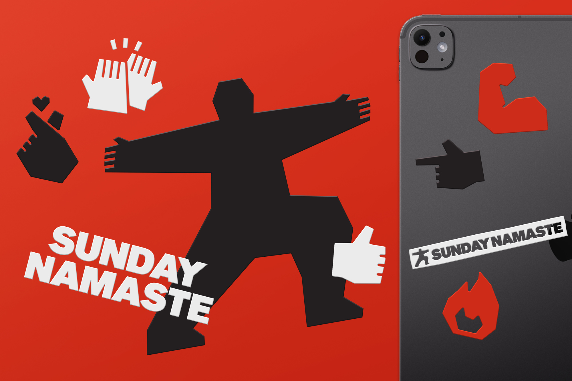
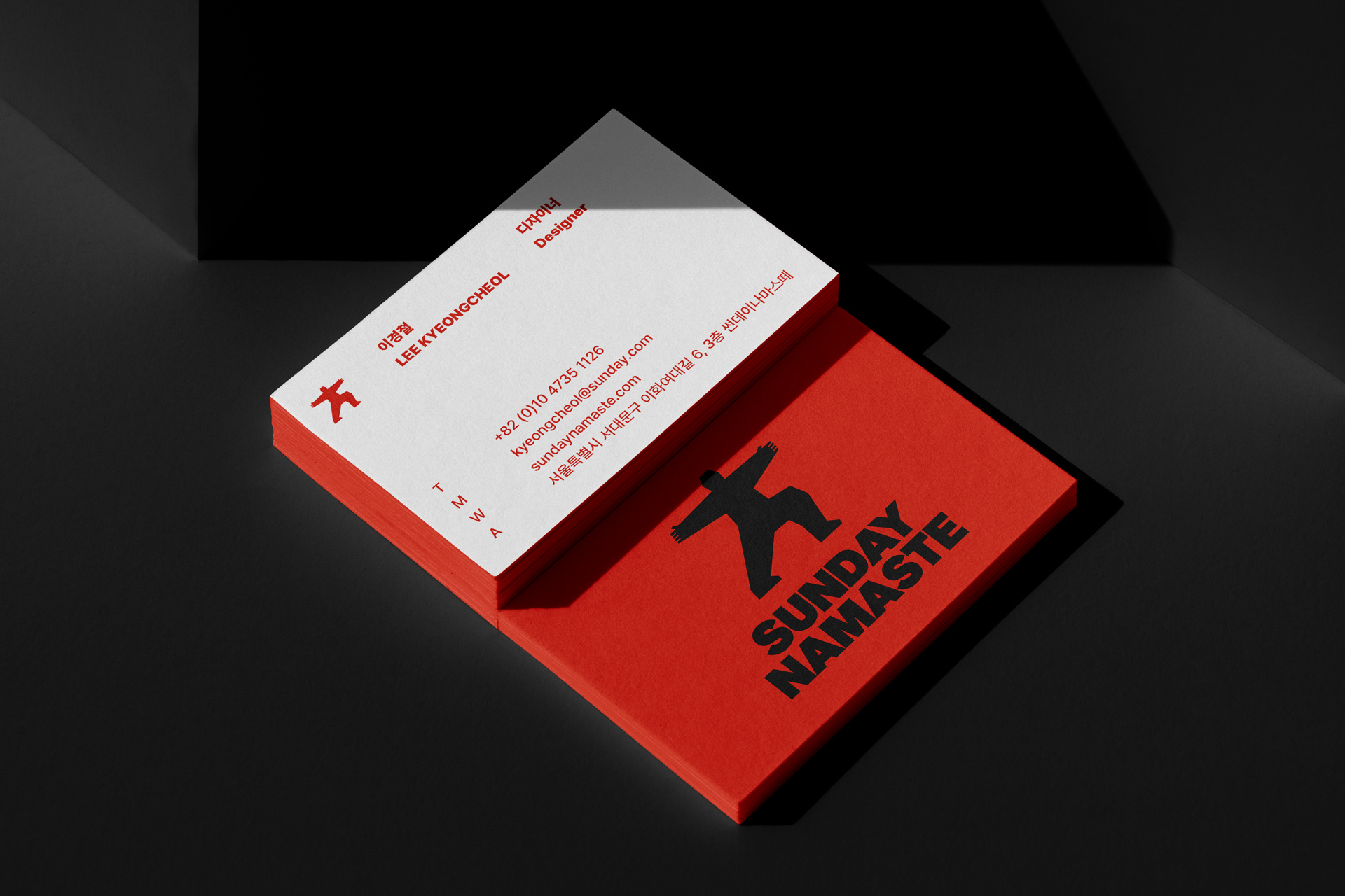
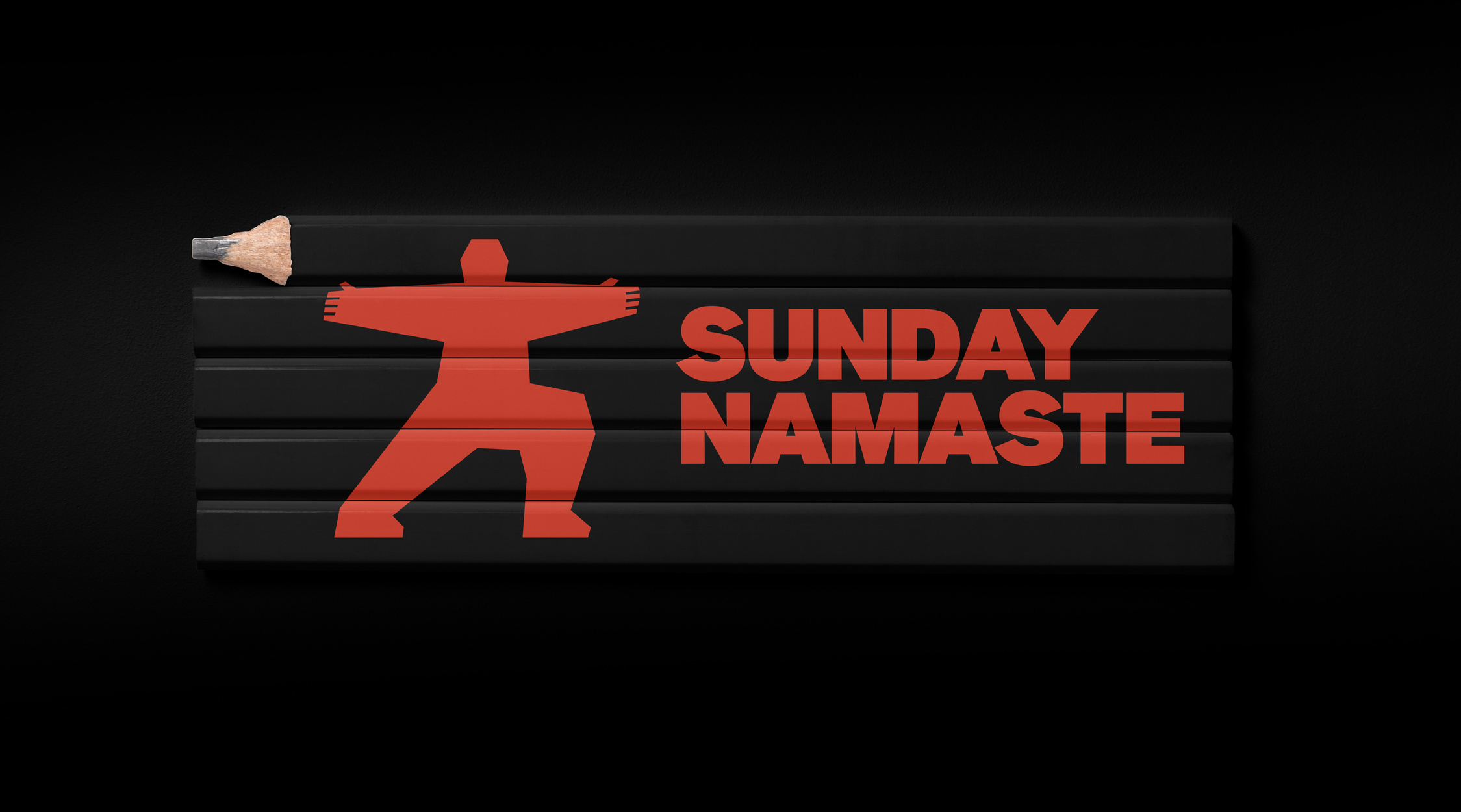
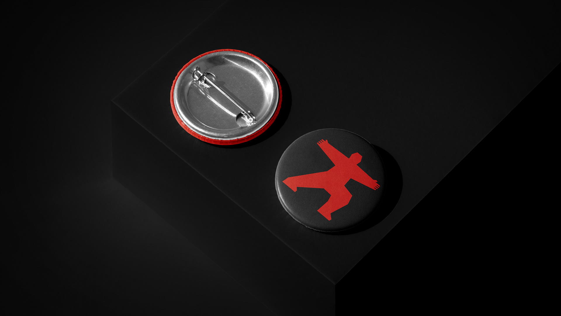
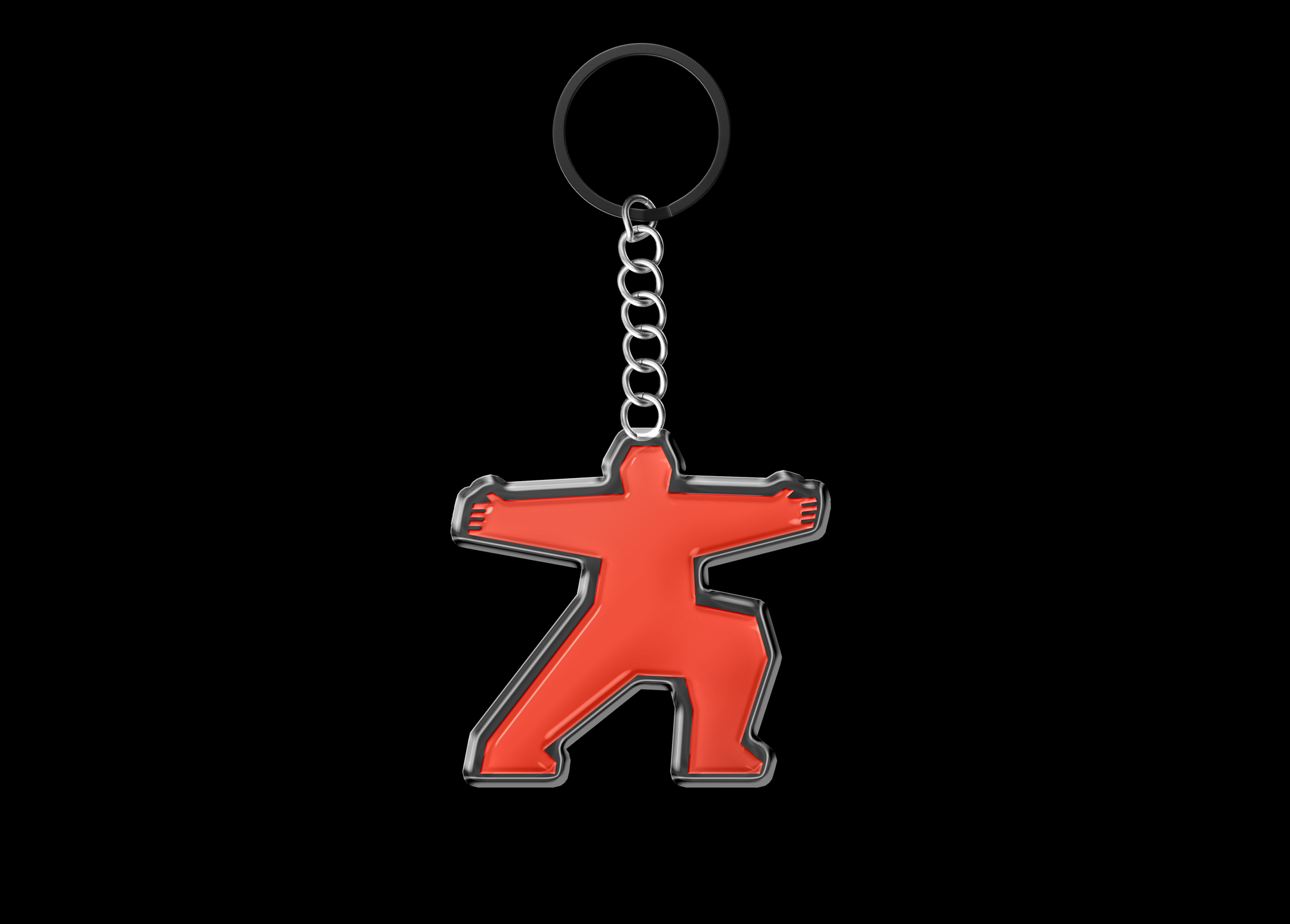
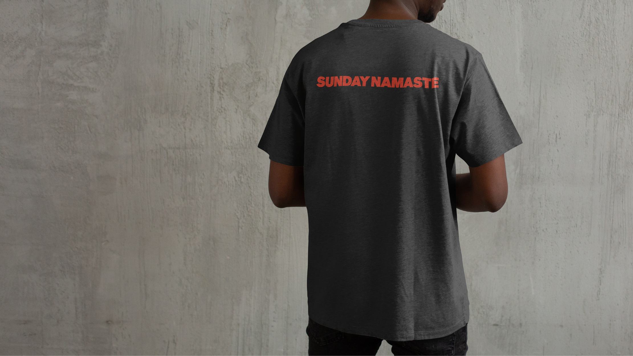
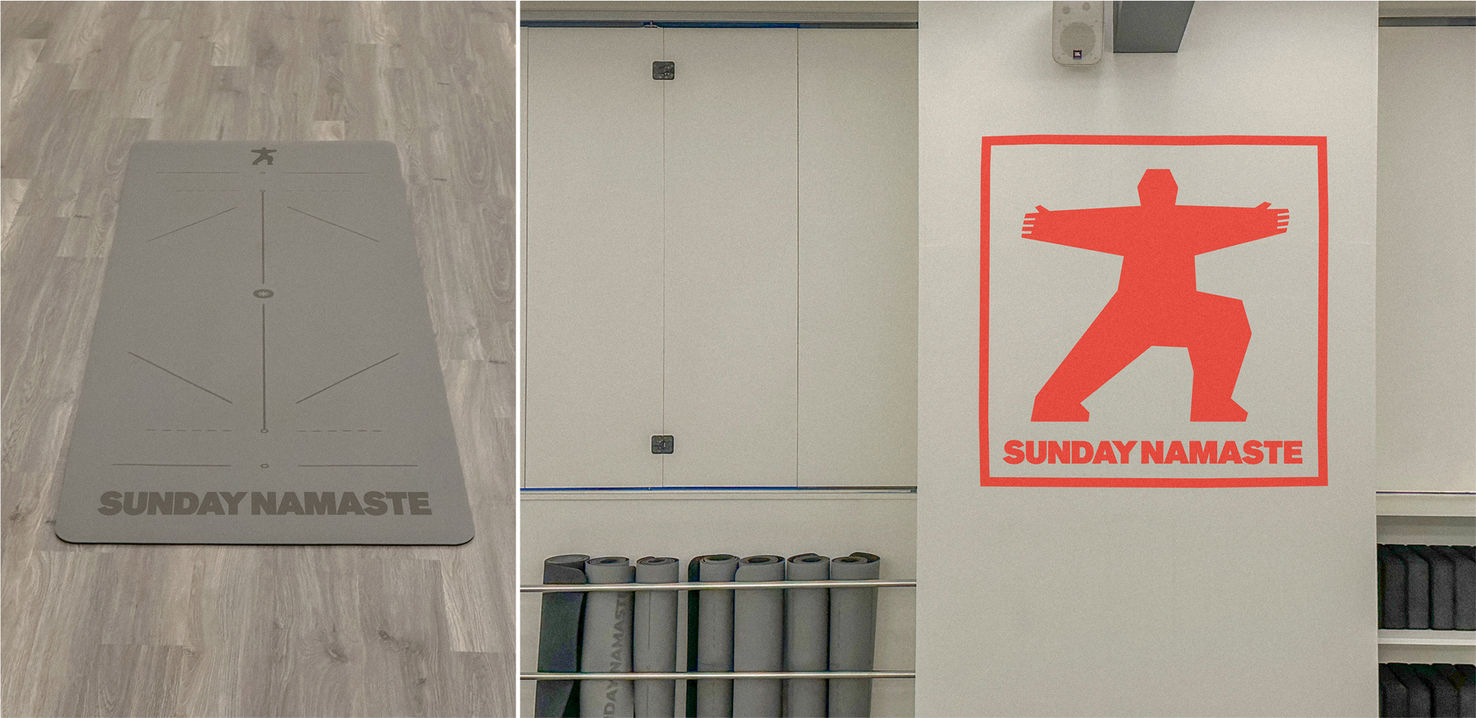
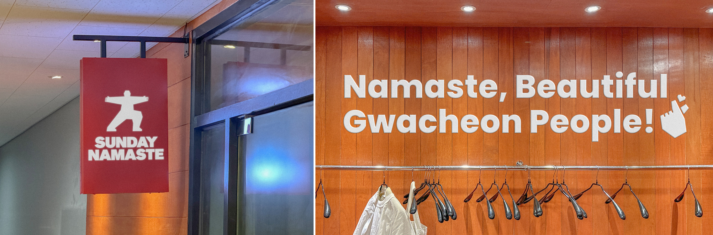
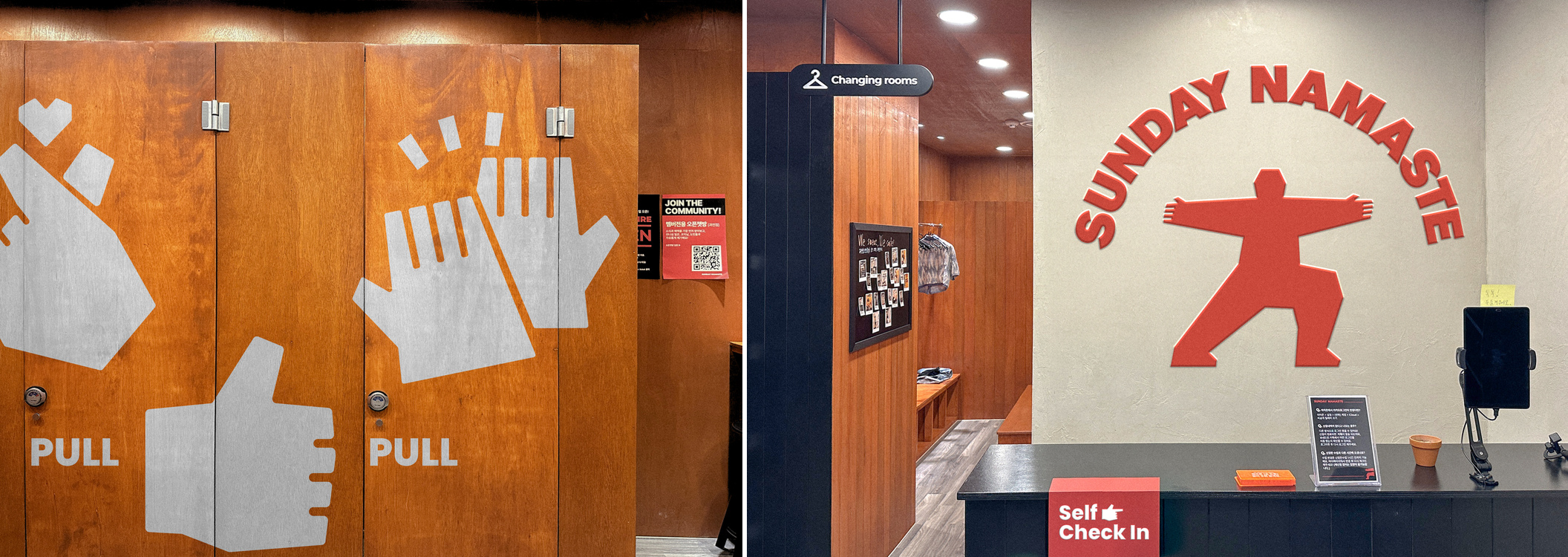
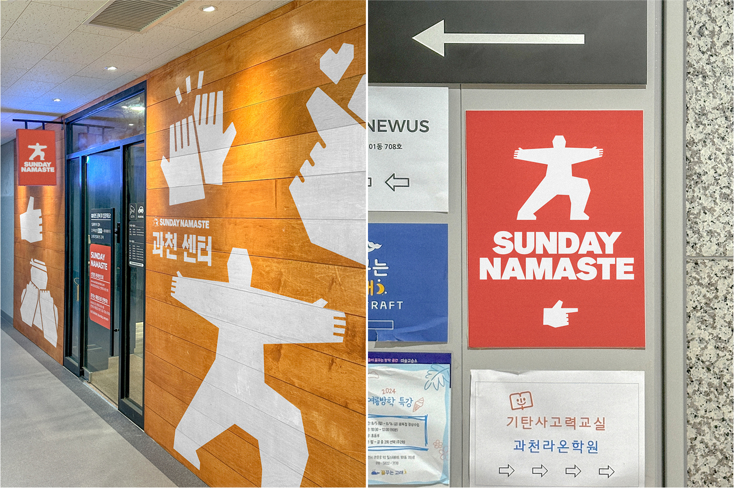
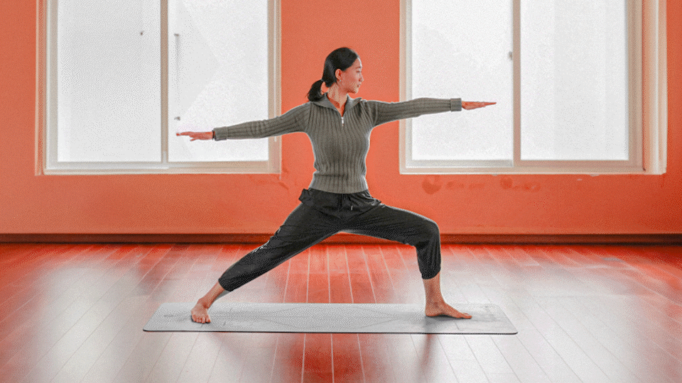
첫째, 요가원의 여성적 이미지에서 벗어나는 것이었습니다. 많은 사람들이 요가원을 낯설고 배타적으로 느끼는 이유는 기존 브랜드의 여성스럽고 차분한 분위기 때문이었습니다. 썬데이나마스떼는 남녀 모두가 즐길 수 있는 활기차고 에너제틱한 요가를 표현하기 위해, 심볼을 연꽃자세 대신 전사자세로 설정했습니다. 블랙+레드의 강렬한 컬러와 각지고 투박한 조형은 캐주얼하면서도 힘 있는 인상을 만들어냈습니다.
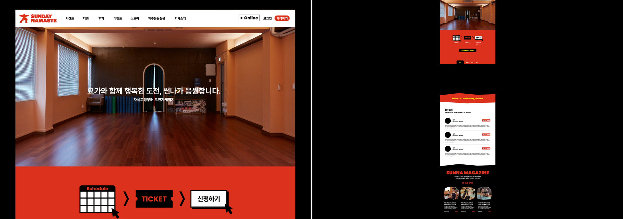
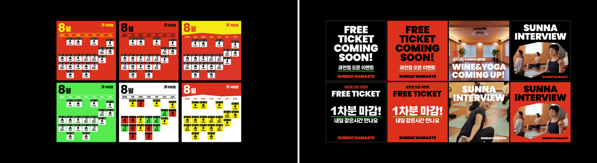
둘째, 온라인 경험의 최적화입니다. 프로그램 운영과 마케팅을 온라인 중심으로 펼치는 브랜드 특성을 고려해, 홈페이지 GUI를 새롭게 디자인하고 인스타그램 템플릿을 제공했습니다. 또한 아이콘·SNS 그래픽 등 다양한 지면에 활용할 수 있는 모티프 시스템을 개발했습니다. 모든 가이드는 Figma로 전달해 브랜드와 운영팀 간 리소스 낭비를 줄였습니다.
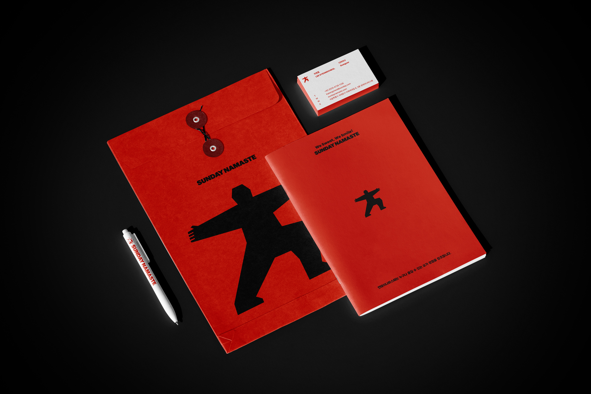
셋째, 프랜차이즈 확장성을 고려했습니다. 단일 지점을 넘어 다수의 지점에서 일관성을 유지하기 위해, 오프라인 환경에서도 적용 가능한 아이덴티티 시스템을 마련했습니다. 컬러·폰트·응용 가이드까지 포함된 체계적 기준을 설정해, 브랜드가 확장되더라도 퀄리티를 유지할 수 있도록 했습니다.
이번 리뉴얼은 단순한 디자인 변경이 아니라, 브랜드의 미션인 “누구나 즐길 수 있는 요가 경험”을 현실적으로 뒷받침하는 과정이었습니다.
“Sunday Namaste” is a yoga brand built on the mission of creating experiences anyone can enjoy. Studio Duggubi renewed its identity with three key priorities.
First, breaking away from the overly feminine image of yoga studios. The new symbol is inspired by the Warrior Pose instead of the Lotus, combined with bold black and red colors and angular forms to express energy, inclusivity, and a casual spirit.
Second, optimizing the online experience. The brand’s website GUI was redesigned, Instagram templates were provided, and a graphic motif system was developed for use across digital platforms. All guidelines were delivered in Figma to ensure efficiency and consistency.
Third, scalability for franchise expansion. A comprehensive identity system with clear rules for color, typography, and applications was established to maintain brand quality across multiple locations.
This renewal goes beyond visual change, reinforcing the mission of making yoga accessible to all.
‘썬데이나마스떼’는 “누구나 즐길 수 있는 요가 경험을 만듭니다”라는 미션 아래, 요가를 현대적 건강 라이프스타일 속에서 재해석하는 브랜드입니다. 스튜디오두꺼비는 이번 아이덴티티 리뉴얼에서 세 가지 방향에 집중했습니다.
첫째, 요가원의 여성적 이미지에서 벗어나는 것이었습니다. 많은 사람들이 요가원을 낯설고 배타적으로 느끼는 이유는 기존 브랜드의 여성스럽고 차분한 분위기 때문이었습니다. 썬데이나마스떼는 남녀 모두가 즐길 수 있는 활기차고 에너제틱한 요가를 표현하기 위해, 심볼을 연꽃자세 대신 전사자세로 설정했습니다. 블랙+레드의 강렬한 컬러와 각지고 투박한 조형은 캐주얼하면서도 힘 있는 인상을 만들어냈습니다.
둘째, 온라인 경험의 최적화입니다. 프로그램 운영과 마케팅을 온라인 중심으로 펼치는 브랜드 특성을 고려해, 홈페이지 GUI를 새롭게 디자인하고 인스타그램 템플릿을 제공했습니다. 또한 아이콘·SNS 그래픽 등 다양한 지면에 활용할 수 있는 모티프 시스템을 개발했습니다. 모든 가이드는 Figma로 전달해 브랜드와 운영팀 간 리소스 낭비를 줄였습니다.
셋째, 프랜차이즈 확장성을 고려했습니다. 단일 지점을 넘어 다수의 지점에서 일관성을 유지하기 위해, 오프라인 환경에서도 적용 가능한 아이덴티티 시스템을 마련했습니다. 컬러·폰트·응용 가이드까지 포함된 체계적 기준을 설정해, 브랜드가 확장되더라도 퀄리티를 유지할 수 있도록 했습니다.
이번 리뉴얼은 단순한 디자인 변경이 아니라, 브랜드의 미션인 “누구나 즐길 수 있는 요가 경험”을 현실적으로 뒷받침하는 과정이었습니다.
“Sunday Namaste” is a yoga brand built on the mission of creating experiences anyone can enjoy. Studio Duggubi renewed its identity with three key priorities.
First, breaking away from the overly feminine image of yoga studios. The new symbol is inspired by the Warrior Pose instead of the Lotus, combined with bold black and red colors and angular forms to express energy, inclusivity, and a casual spirit.
Second, optimizing the online experience. The brand’s website GUI was redesigned, Instagram templates were provided, and a graphic motif system was developed for use across digital platforms. All guidelines were delivered in Figma to ensure efficiency and consistency.
Third, scalability for franchise expansion. A comprehensive identity system with clear rules for color, typography, and applications was established to maintain brand quality across multiple locations.
This renewal goes beyond visual change, reinforcing the mission of making yoga accessible to all.