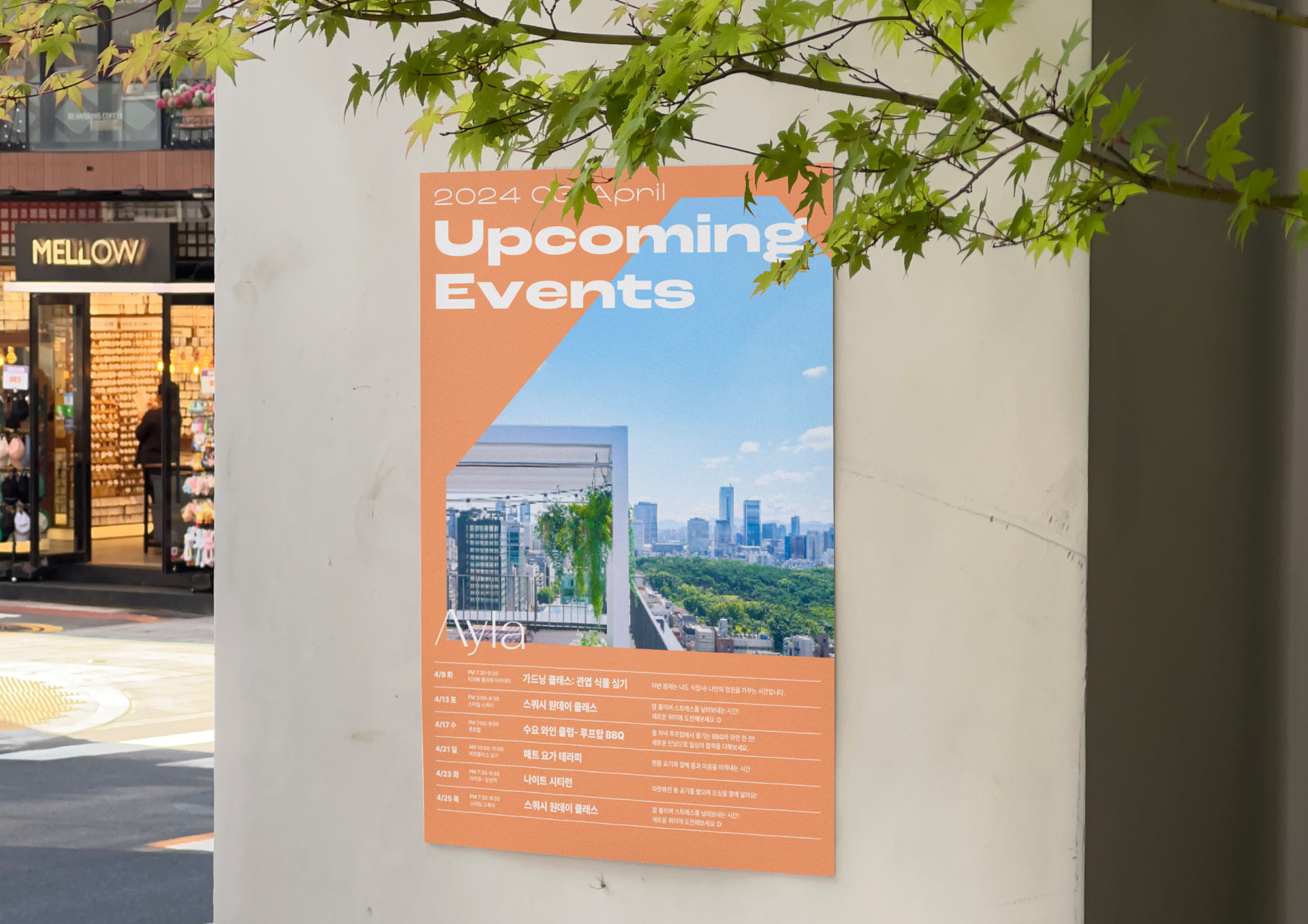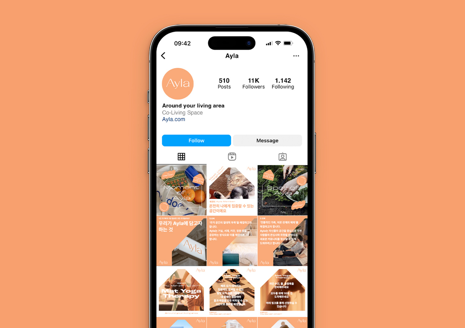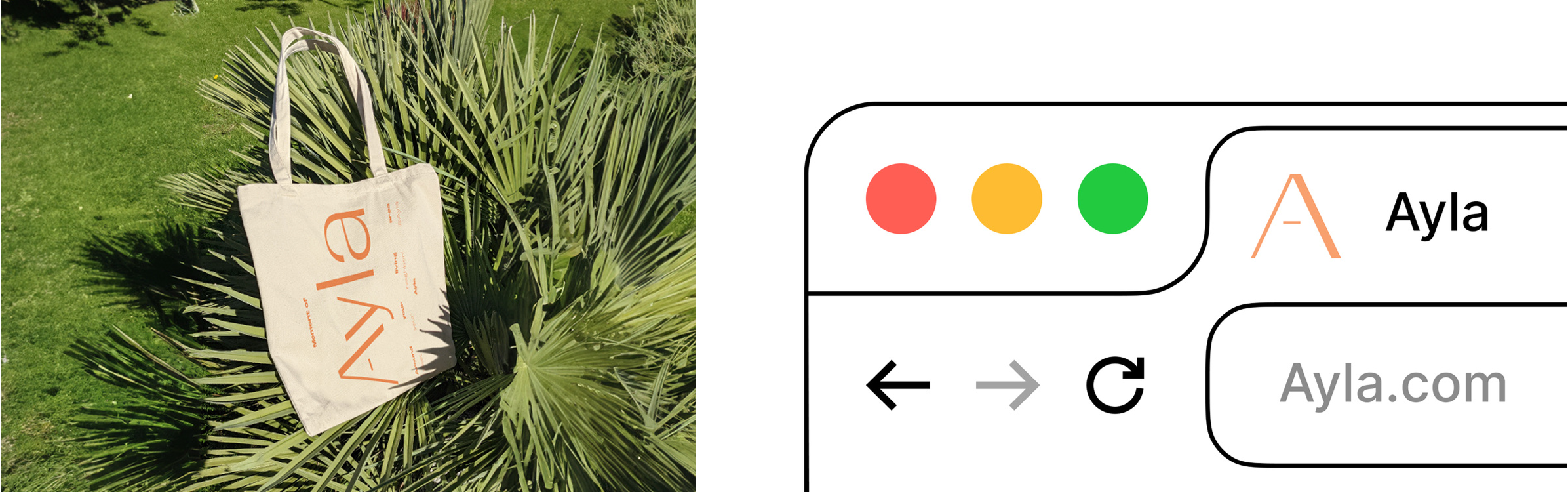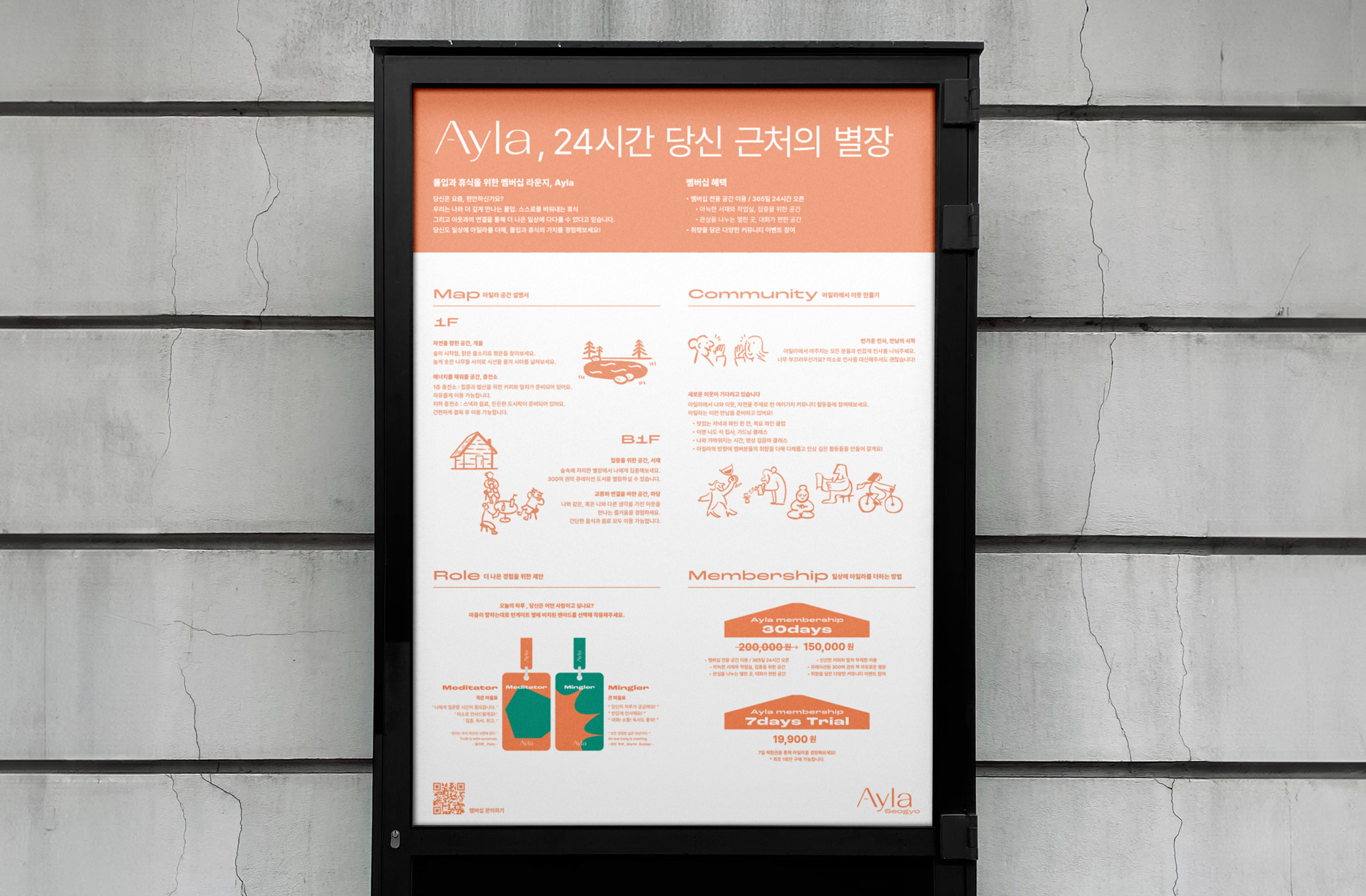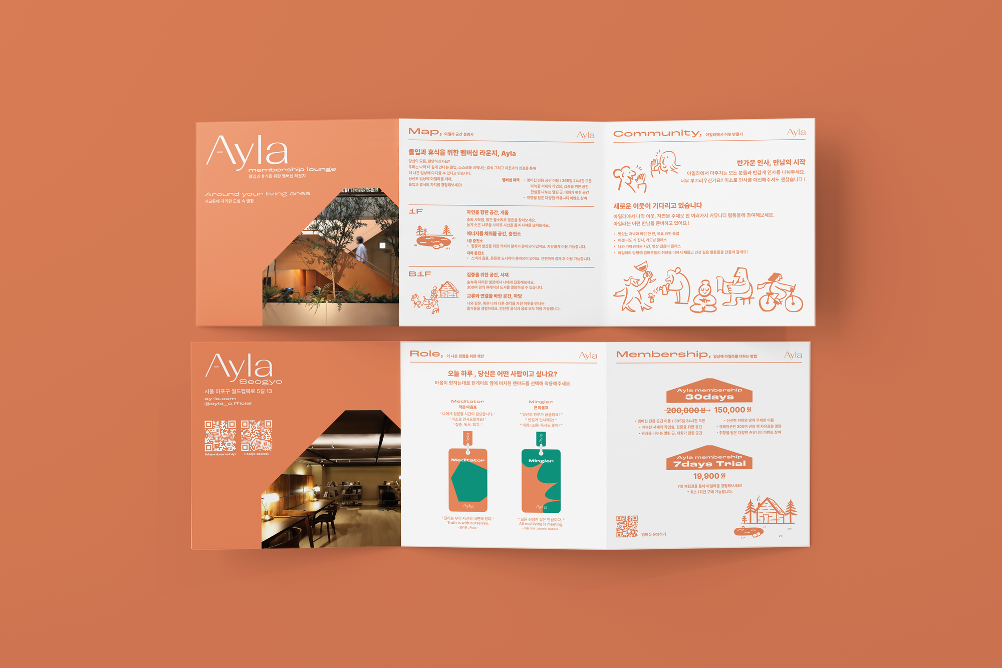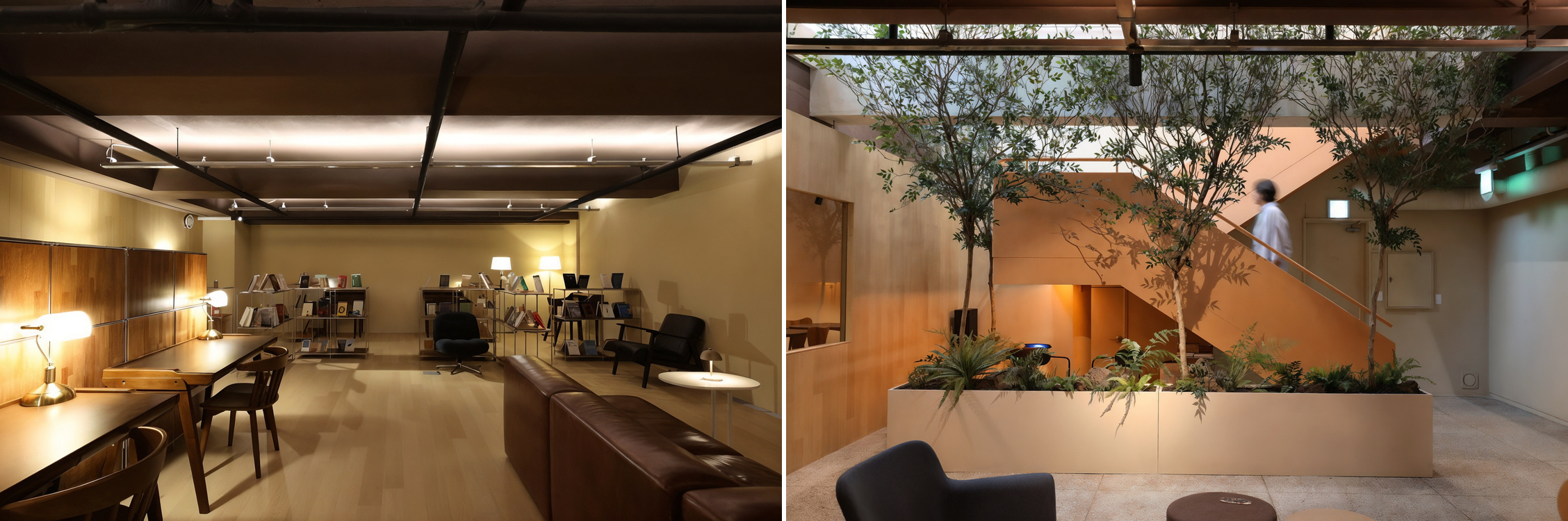
Ayla(아일라)는 현대인의 새로운 주거 방식을 제안하는 코리빙(Co-Living) 브랜드입니다. 단순한 거주 공간이 아니라, 다양한 사람들이 함께 살아가며 관계와 경험을 공유하는 ‘도심 속 별장 멤버십’을 지향합니다.
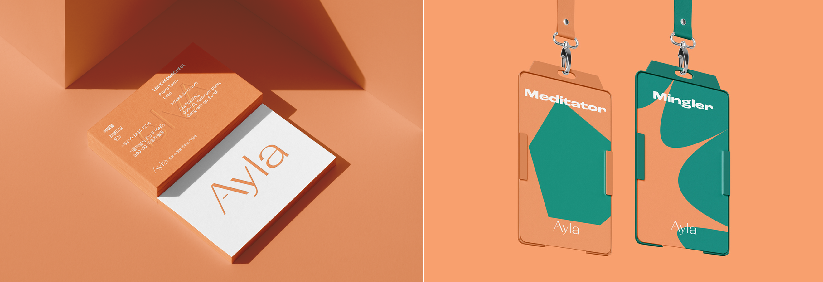
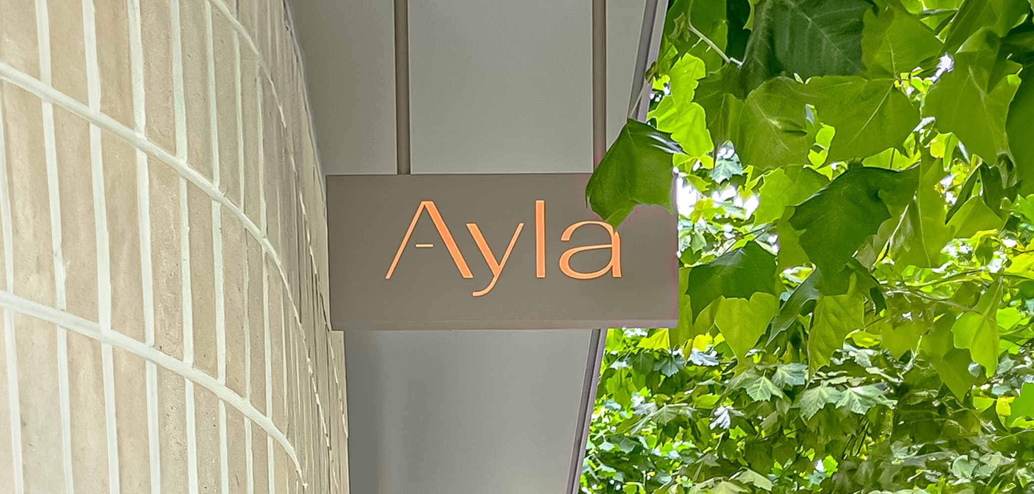
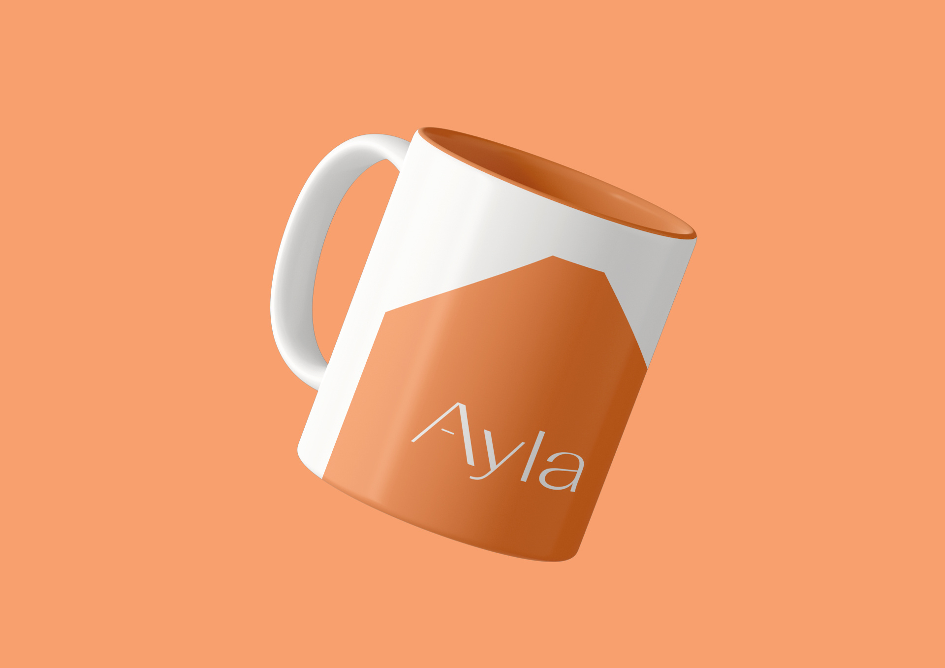
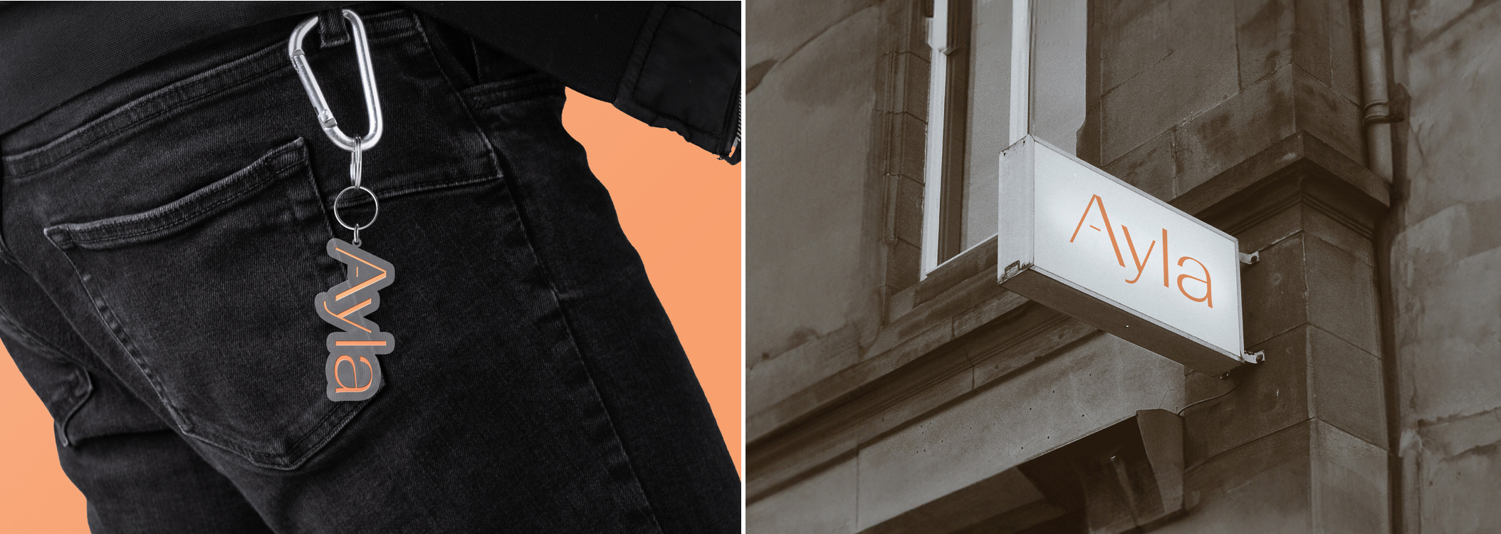
스튜디오두꺼비는 Ayla의 아이덴티티를 통해 이러한 철학을 시각적으로 풀어냈습니다. 로고의 중심인 ‘A’는 지붕을 닮은 형태로, 따뜻한 보금자리이자 커뮤니티의 상징입니다. 그 아래의 라인은 사람과 경험을 잇는 끈으로, Ayla를 통해 스스로 성장해가는 여정을 의미합니다.
로고타입은 굵기 대비가 뚜렷한 산세리프 구조로 리듬감과 안정감을 전달하며, 메인 컬러 ‘Ayla Coral’은 따뜻하고 친근한 감각을 더해 브랜드의 포용적인 분위기를 완성합니다.
Ayla의 아이덴티티는 새로운 만남, 일상의 연결, 그리고 삶의 확장을 시각 언어로 담아냅니다. 단순한 공간이 아닌, 함께 머물며 성장하는 경험. 그것이 Ayla가 제안하는 삶의 방식입니다.
Ayla is a co-living brand that redefines urban living for modern individuals. More than just a place to stay, Ayla offers a “city retreat membership” — a space where diverse people share their lives, connect, and create new opportunities together.
Studio Duggubi visualized Ayla’s philosophy through its identity design. The central “A” resembles a roof, symbolizing both shelter and community. The line beneath represents a thread that connects people and experiences — the journey of growth that unfolds through life with Ayla.
The logotype’s balanced sans-serif structure conveys rhythm and stability, while the signature color, Ayla Coral, brings warmth and friendliness, completing the brand’s inviting atmosphere.
Ayla(아일라)는 현대인의 새로운 주거 방식을 제안하는 코리빙(Co-Living) 브랜드입니다. 단순한 거주 공간이 아니라, 다양한 사람들이 함께 살아가며 관계와 경험을 공유하는 ‘도심 속 별장 멤버십’을 지향합니다.
스튜디오두꺼비는 Ayla의 아이덴티티를 통해 이러한 철학을 시각적으로 풀어냈습니다. 로고의 중심인 ‘A’는 지붕을 닮은 형태로, 따뜻한 보금자리이자 커뮤니티의 상징입니다. 그 아래의 라인은 사람과 경험을 잇는 끈으로, Ayla를 통해 스스로 성장해가는 여정을 의미합니다.
로고타입은 굵기 대비가 뚜렷한 산세리프 구조로 리듬감과 안정감을 전달하며, 메인 컬러 ‘Ayla Coral’은 따뜻하고 친근한 감각을 더해 브랜드의 포용적인 분위기를 완성합니다.
Ayla의 아이덴티티는 새로운 만남, 일상의 연결, 그리고 삶의 확장을 시각 언어로 담아냅니다. 단순한 공간이 아닌, 함께 머물며 성장하는 경험. 그것이 Ayla가 제안하는 삶의 방식입니다.
Ayla is a co-living brand that redefines urban living for modern individuals. More than just a place to stay, Ayla offers a “city retreat membership” — a space where diverse people share their lives, connect, and create new opportunities together.
Studio Duggubi visualized Ayla’s philosophy through its identity design. The central “A” resembles a roof, symbolizing both shelter and community. The line beneath represents a thread that connects people and experiences — the journey of growth that unfolds through life with Ayla.
The logotype’s balanced sans-serif structure conveys rhythm and stability, while the signature color, Ayla Coral, brings warmth and friendliness, completing the brand’s inviting atmosphere.