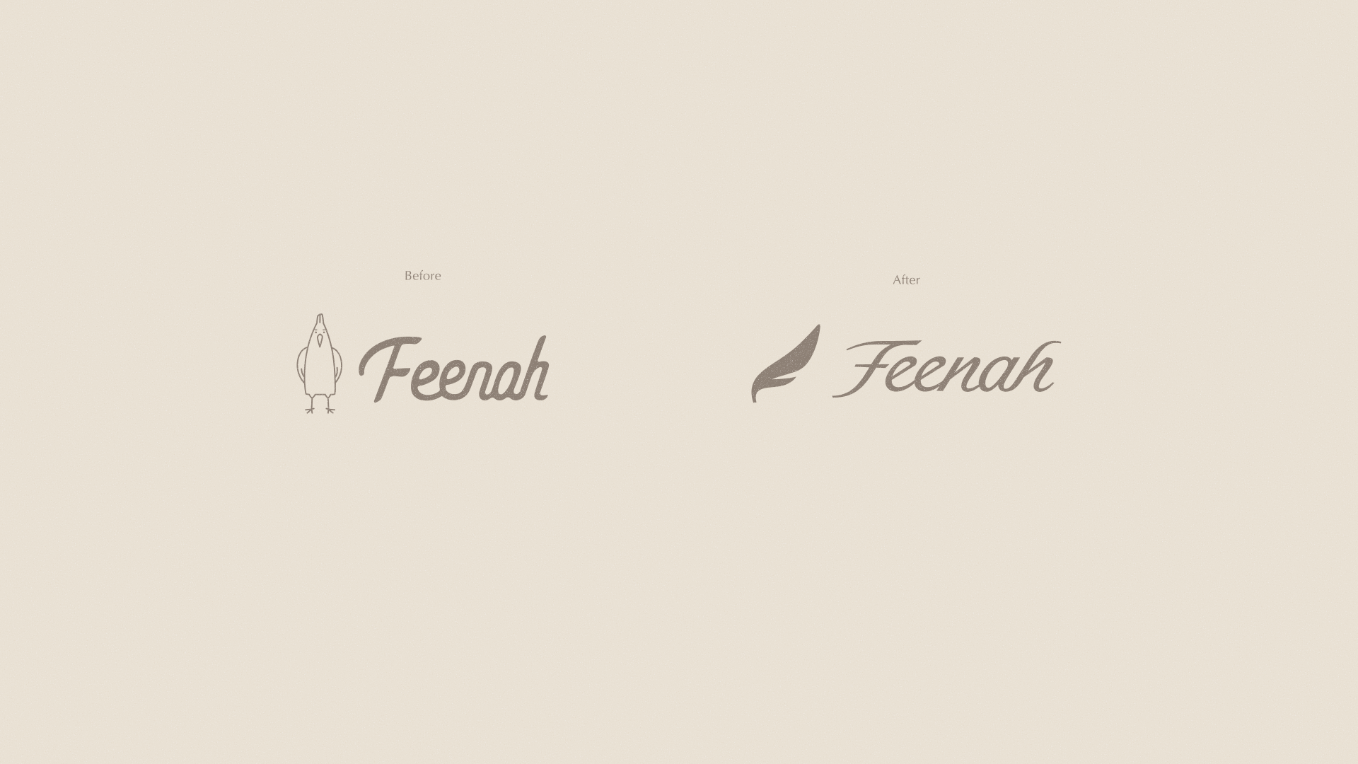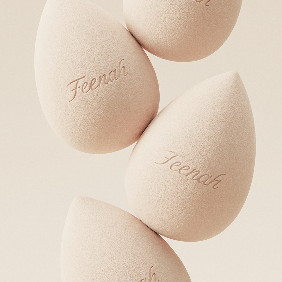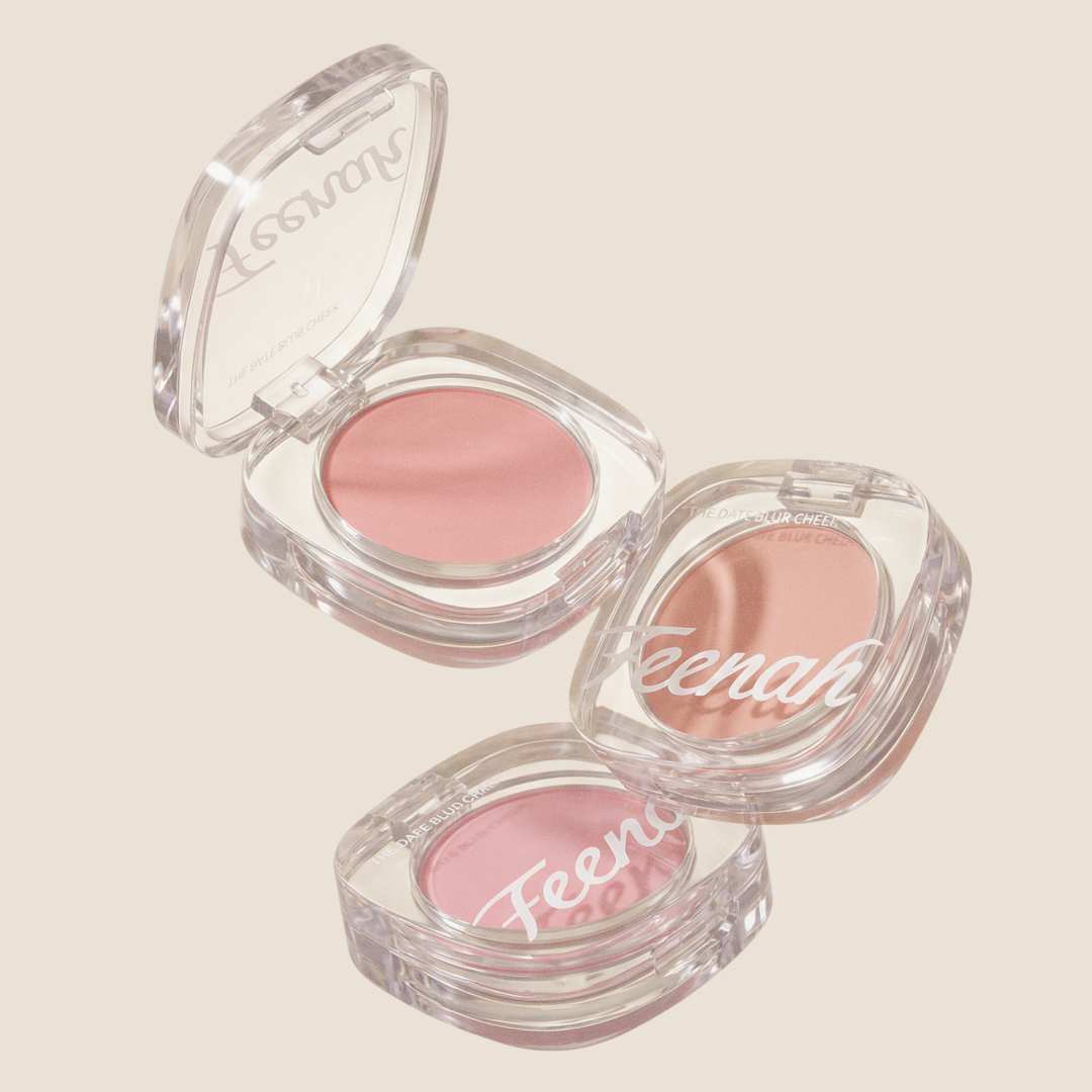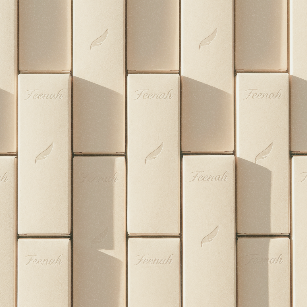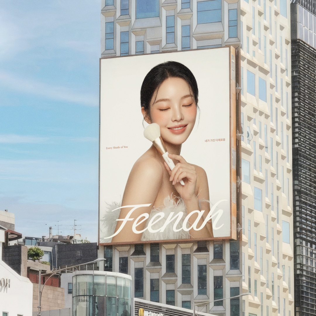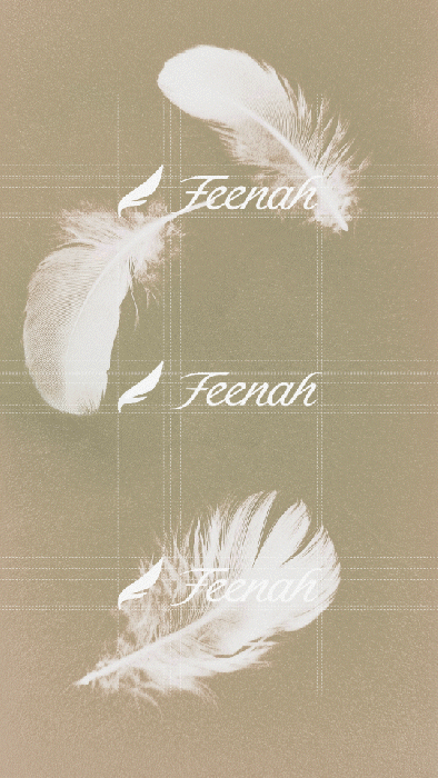
Feenah(피나) 리브랜딩 프로젝트, 브랜드에 프리미엄한 가치를 더하는 리브랜딩
Feenah(피나) 리브랜딩 프로젝트는 브랜드가 지닌 부드럽고 섬세한 감성을 유지하면서, 그 위에 보다 프리미엄한 가치를 더하기 위해 진행한 작업이었습니다. 단순히 새로운 이미지를 입히는 방식이 아니라, Feenah가 오랜 시간 쌓아온 분위기와 인상을 바탕으로 브랜드의 결을 더욱 정제되고 깊이 있게 다듬는 데 집중했습니다.
이를 위해 기존 자산이 가진 친근하고 유연한 인상은 유지하되, 형태의 균형과 흐름, 디테일의 밀도를 보다 세심하게 조율하여 한층 더 우아하고 안정적인 인상으로 읽히도록 설계했습니다. 특히 상징 요소는 불필요한 장식을 덜어내고, 보다 간결하고 정제된 조형으로 재구성함으로써 Feenah가 지향하는 섬세한 아름다움을 더욱 선명한 시각 언어로 구현하고자 했습니다.
이번 리브랜딩은 브랜드를 완전히 새롭게 바꾸는 작업이 아니라, 본래 지니고 있던 감성을 해치지 않으면서 그 안에 프리미엄한 가치를 조용히 덧입히는 과정이었습니다. 그 결과 Feenah는 기존의 부드러운 이미지 위에 보다 현대적이고 세련된 인상을 갖추게 되었으며, 브랜드가 전달하고자 하는 아름다움 역시 더욱 깊고 단단한 방식으로 표현될 수 있었습니다.
The Feenah rebranding project was carried out to add a more premium value to the brand while preserving its soft and delicate sensibility. Rather than simply applying a new image, the project focused on refining the brand’s existing character with greater depth and clarity, building on the atmosphere Feenah had established over time.
While maintaining the approachable and fluid impression of the existing assets, we carefully refined the balance, flow, and level of detail to create a more elegant and stable overall image. In particular, the symbol was simplified and polished by removing unnecessary decorative elements, allowing Feenah’s delicate beauty to be expressed through a clearer visual language.
This rebranding was not about turning Feenah into something entirely new, but about quietly layering premium value onto the sensibility it already had. As a result, the brand was reshaped with a more modern and sophisticated impression, while preserving the softness at its core.