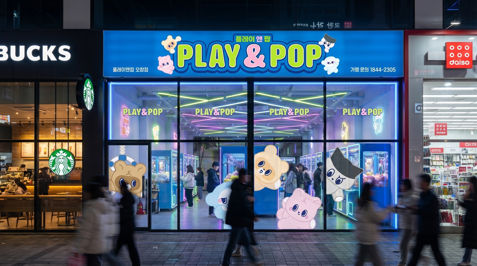
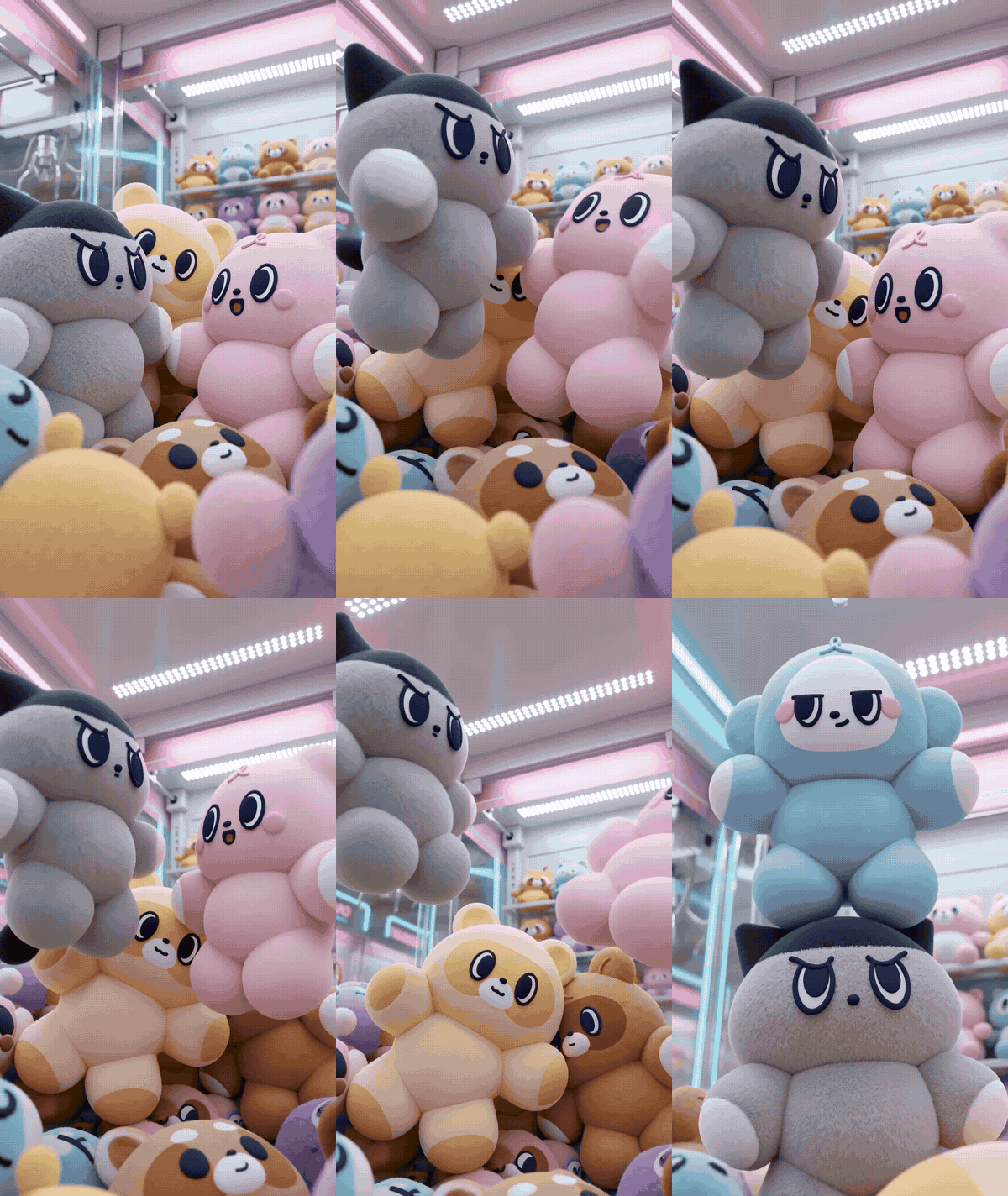
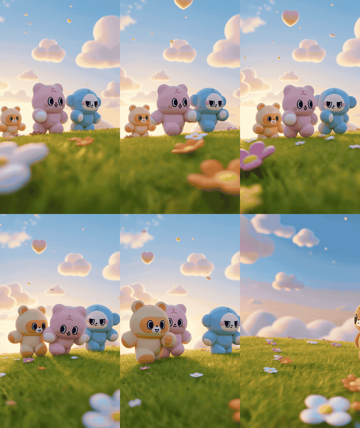
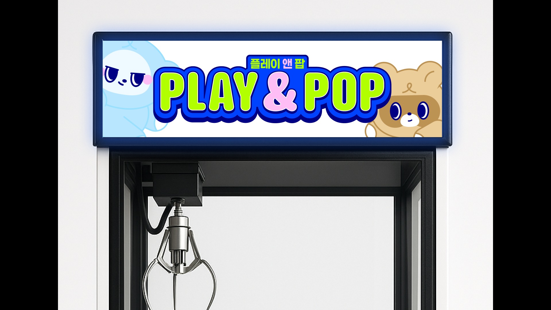
플레이앤팝은 온 가족이 함께 즐기는 놀이 문화공간입니다. 스튜디오두꺼비는 경쾌한 로고와 개성 있는 캐릭터를 중심으로, 매장의 간판과 공간에서 애니메이션까지 이어지는 브랜드 경험을 설계했습니다.
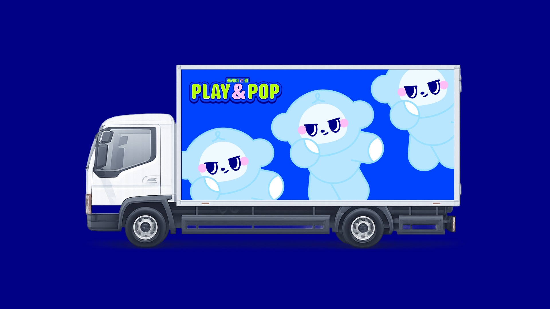
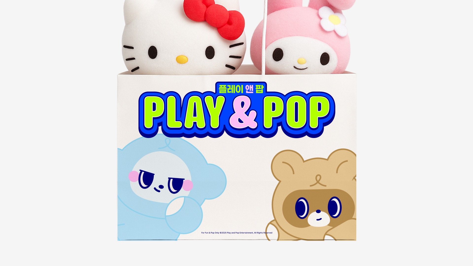
둥글고 부드러운 로고타입과 선명한 블루·라임·핑크 컬러, 서로 다른 표정과 몸짓의 캐릭터가 즐거움이 터지는 브랜드의 성격을 전달합니다. 적용 이미지는 디자인 목업이며, 캐릭터의 움직임과 브랜드 노래는 영상으로 함께 소개합니다.
Play & Pop is a play and entertainment brand for families. STUDIO DUGGUBI developed a lively identity through rounded lettering, distinctive characters, storefront applications and brand animation. Application images are design mockups.
플레이앤팝은 온 가족이 함께 즐기는 놀이 문화공간입니다. 스튜디오두꺼비는 경쾌한 로고와 개성 있는 캐릭터를 중심으로, 매장의 간판과 공간에서 애니메이션까지 이어지는 브랜드 경험을 설계했습니다.
둥글고 부드러운 로고타입과 선명한 블루·라임·핑크 컬러, 서로 다른 표정과 몸짓의 캐릭터가 즐거움이 터지는 브랜드의 성격을 전달합니다. 적용 이미지는 디자인 목업이며, 캐릭터의 움직임과 브랜드 노래는 영상으로 함께 소개합니다.
Play & Pop is a play and entertainment brand for families. STUDIO DUGGUBI developed a lively identity through rounded lettering, distinctive characters, storefront applications and brand animation. Application images are design mockups.
플레이앤팝은 온 가족이 함께 즐기는 놀이 문화공간입니다. 스튜디오두꺼비는 경쾌한 로고와 개성 있는 캐릭터를 중심으로, 매장의 간판과 공간에서 애니메이션까지 이어지는 브랜드 경험을 설계했습니다.
둥글고 부드러운 로고타입과 선명한 블루·라임·핑크 컬러, 서로 다른 표정과 몸짓의 캐릭터가 즐거움이 터지는 브랜드의 성격을 전달합니다. 적용 이미지는 디자인 목업이며, 캐릭터의 움직임과 브랜드 노래는 영상으로 함께 소개합니다.
Play & Pop is a play and entertainment brand for families. STUDIO DUGGUBI developed a lively identity through rounded lettering, distinctive characters, storefront applications and brand animation. Application images are design mockups.