푸르른 아이들을 위한 바른 먹거리, 푸르나이.
우리밀이 30년 넘게 지켜온 정직한 재료의 원칙. 푸르나이는 그 신뢰를 이어받아, 국내 원물을 기반으로 한 독립적인 클린라벨 브랜드로 나아갑니다. 이번 리브랜딩은 오랫동안 쌓아온 신뢰를 오늘의 소비자가 공감할 수 있는 언어와 모습으로 전환하는 작업이었습니다.
기존 로고는 녹색의 자연 모티프와 직선적인 글자 조합으로 건강한 먹거리의 이미지를 전달했습니다. 하지만 친환경 식품에서 흔히 볼 수 있는 표현과 다소 투박한 조형은 푸르나이만의 개성을 드러내기에 한계가 있었습니다. 우리는 익숙한 친환경의 상징을 반복하기보다, 브랜드가 누구를 위해 어떤 마음으로 먹거리를 만드는지에 주목했습니다.
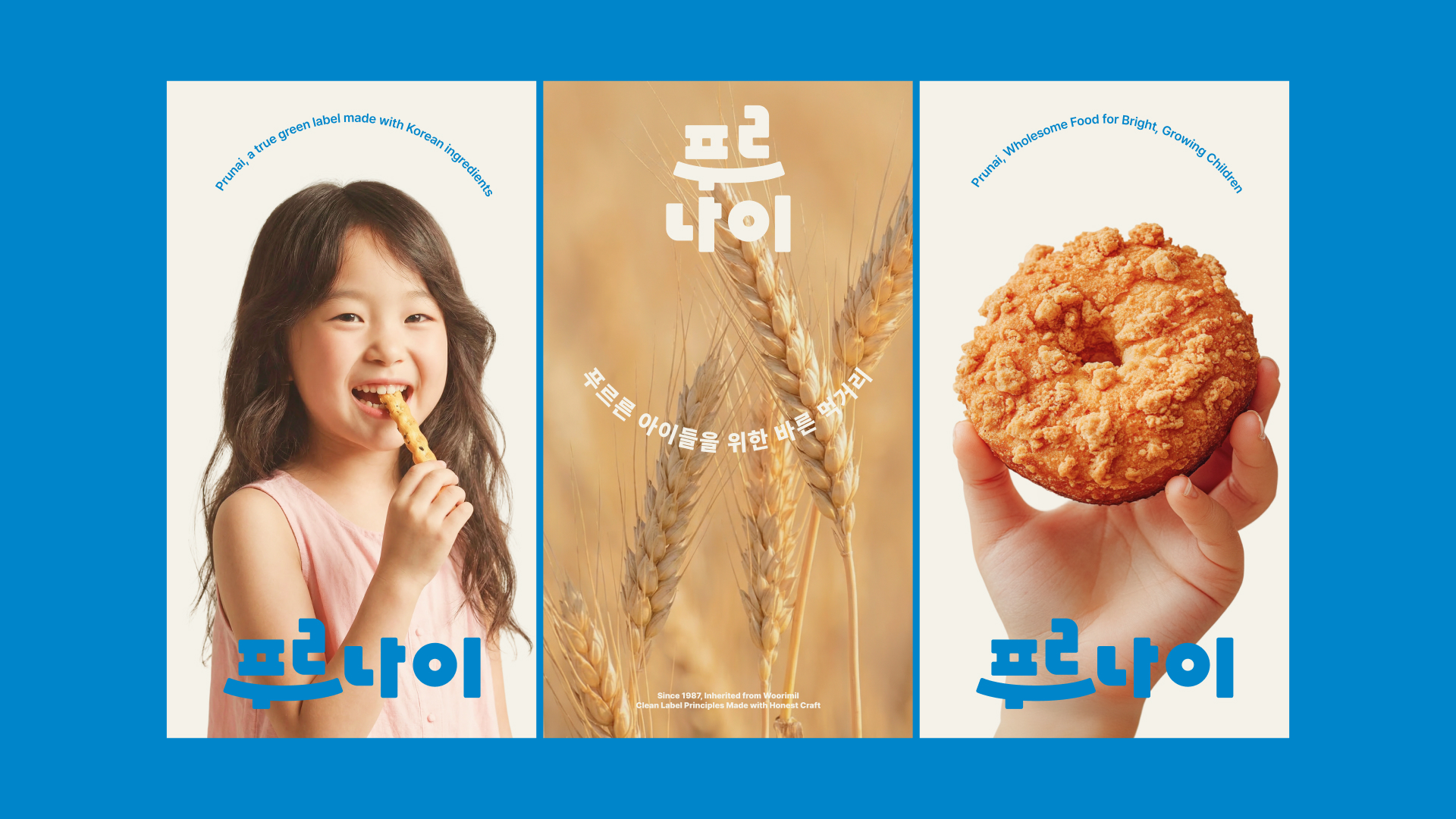
그 중심에는 ‘아이를 보듬고 지켜주는 어른의 마음’이 있습니다. 아이가 건강하게 자랄 수 있도록 원재료부터 생산까지 타협하지 않는 기준을 지키는 마음입니다. 새로운 로고는 이 태도를 웃음과 포옹의 형태로 풀어냈습니다. 글자의 비례와 간격을 정돈하고 부드러운 곡선과 단단한 획을 함께 사용해, 아이에게는 친근하고 부모에게는 믿음직한 인상을 만들었습니다.
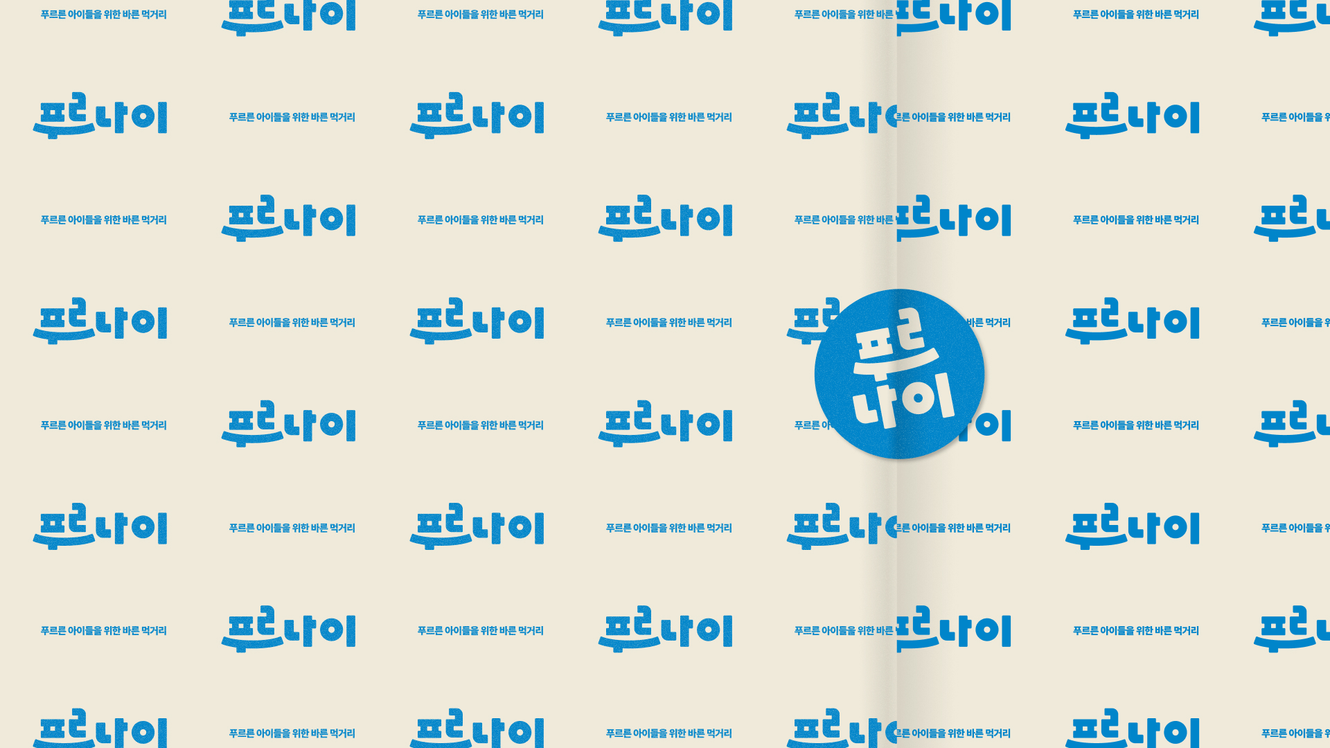
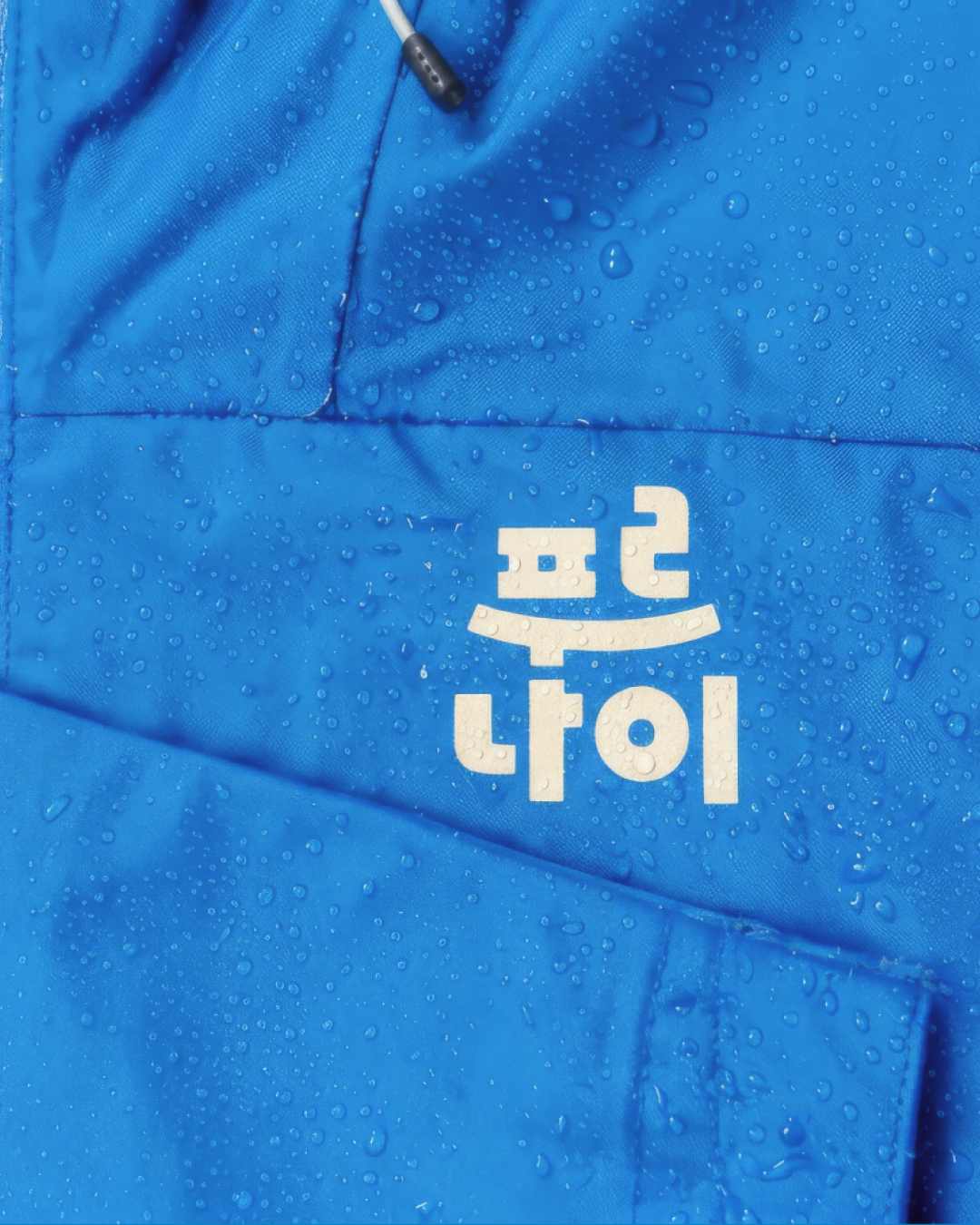
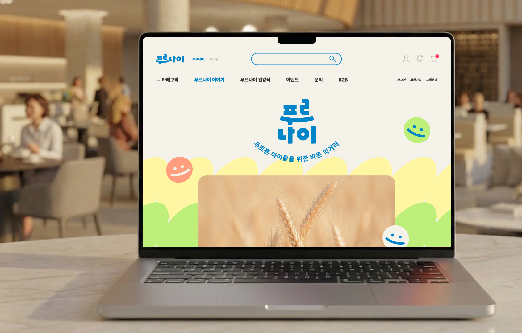
브랜드 컬러는 관습적인 초록에서 벗어나 밀밭 위 하늘을 닮은 선명한 블루를 중심으로 구성했습니다. 정직한 생산 과정과 맑은 신뢰를 담은 블루에 밝고 따뜻한 보조색을 더하고, 바람에 흔들리는 밀에서 출발한 그래픽으로 건강한 생동감을 표현했습니다.
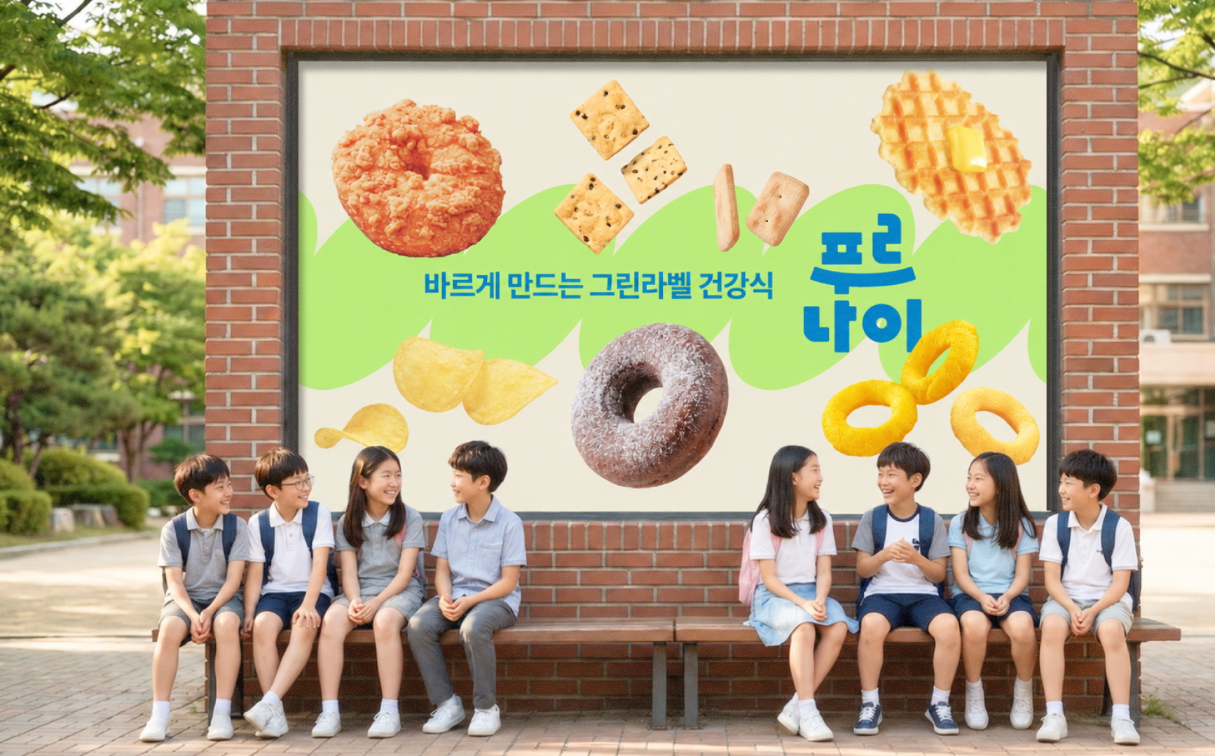
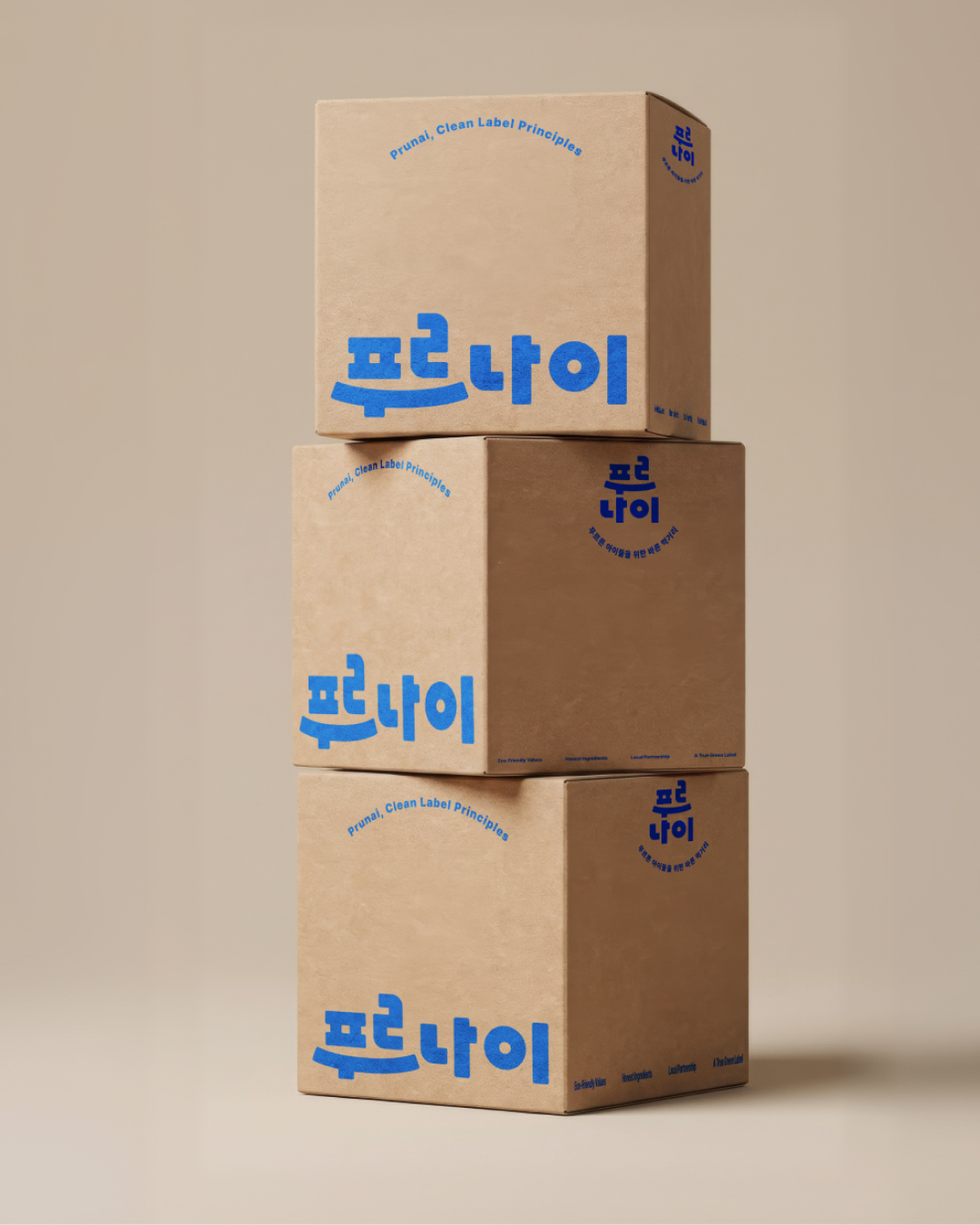
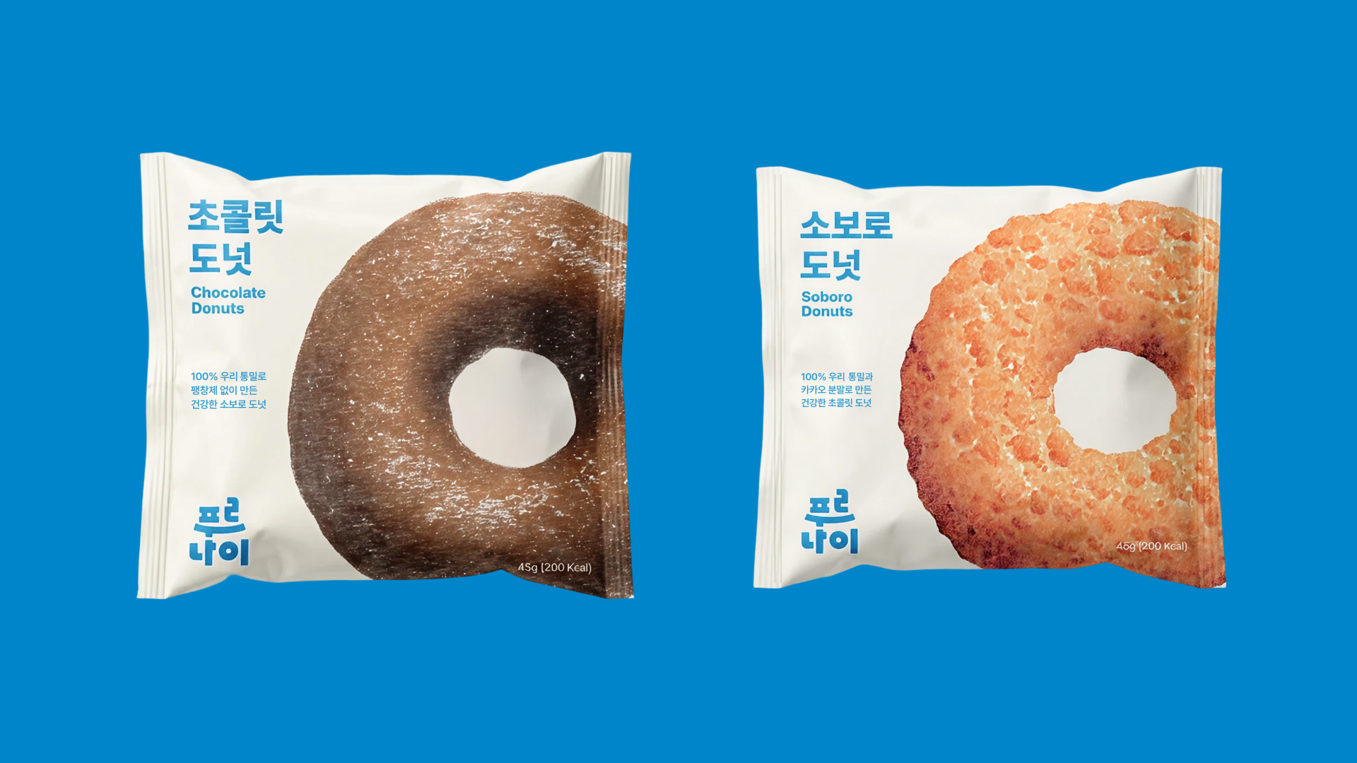
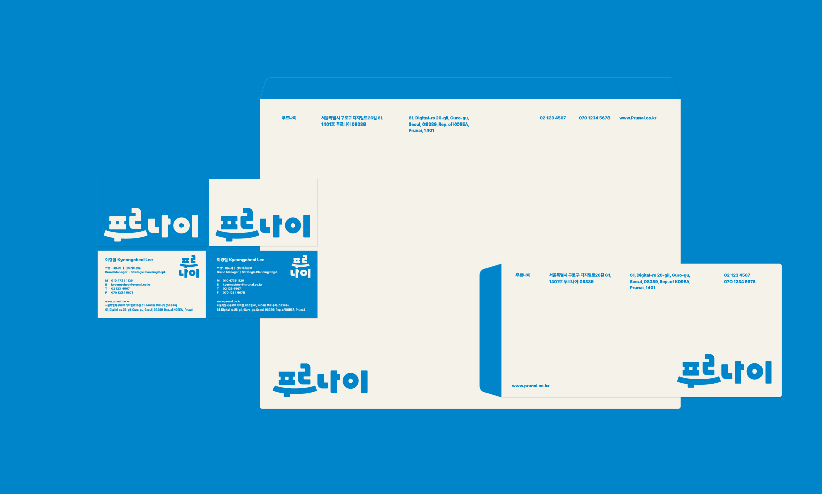
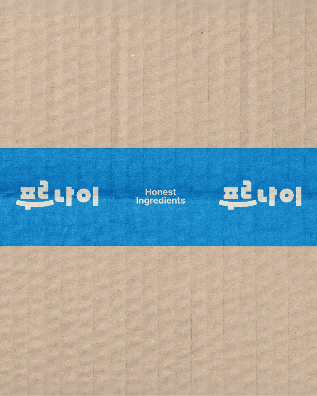
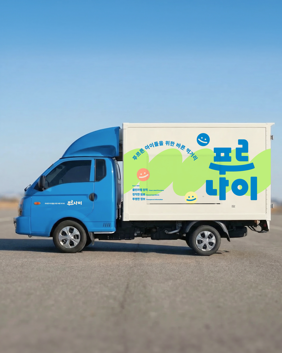
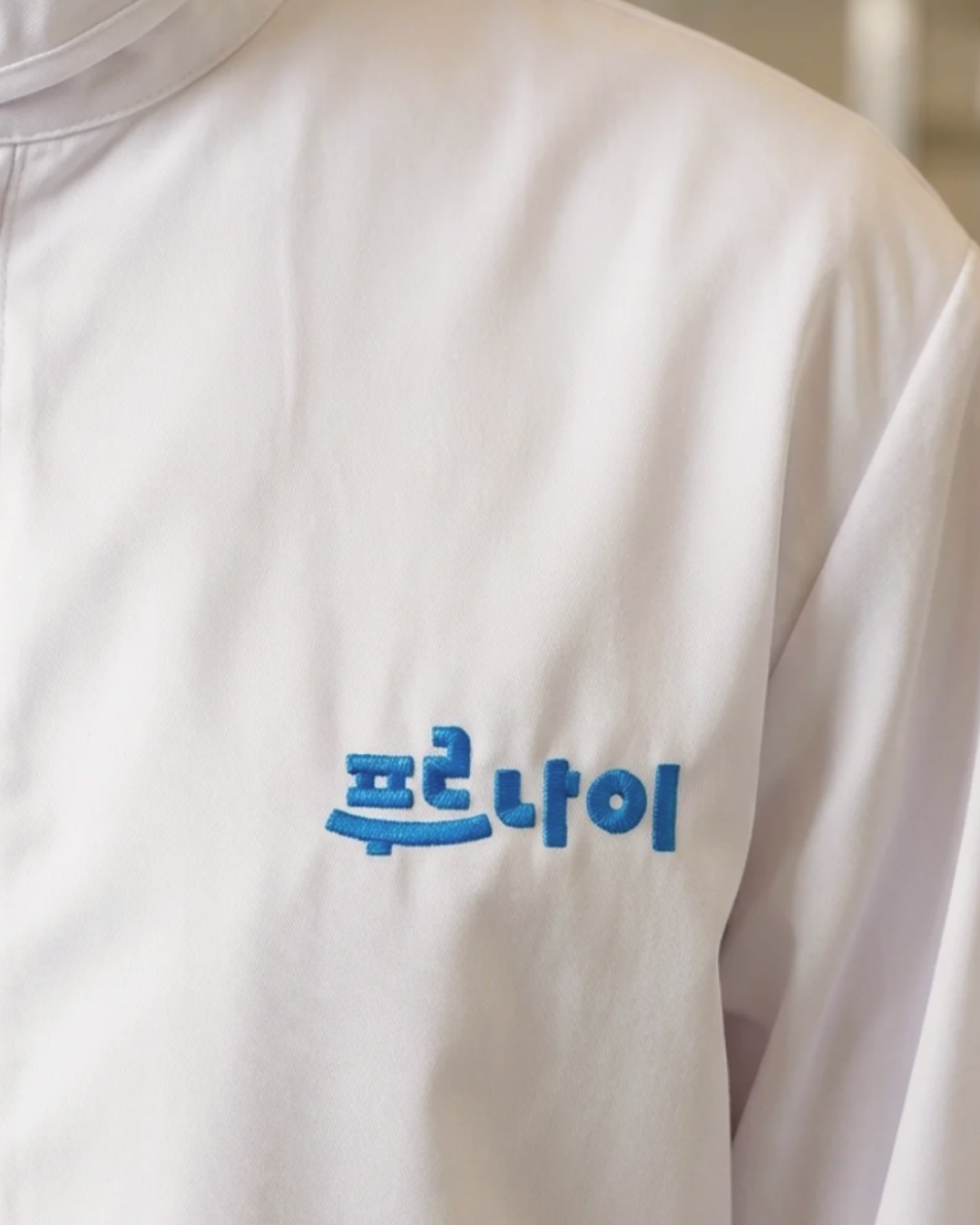
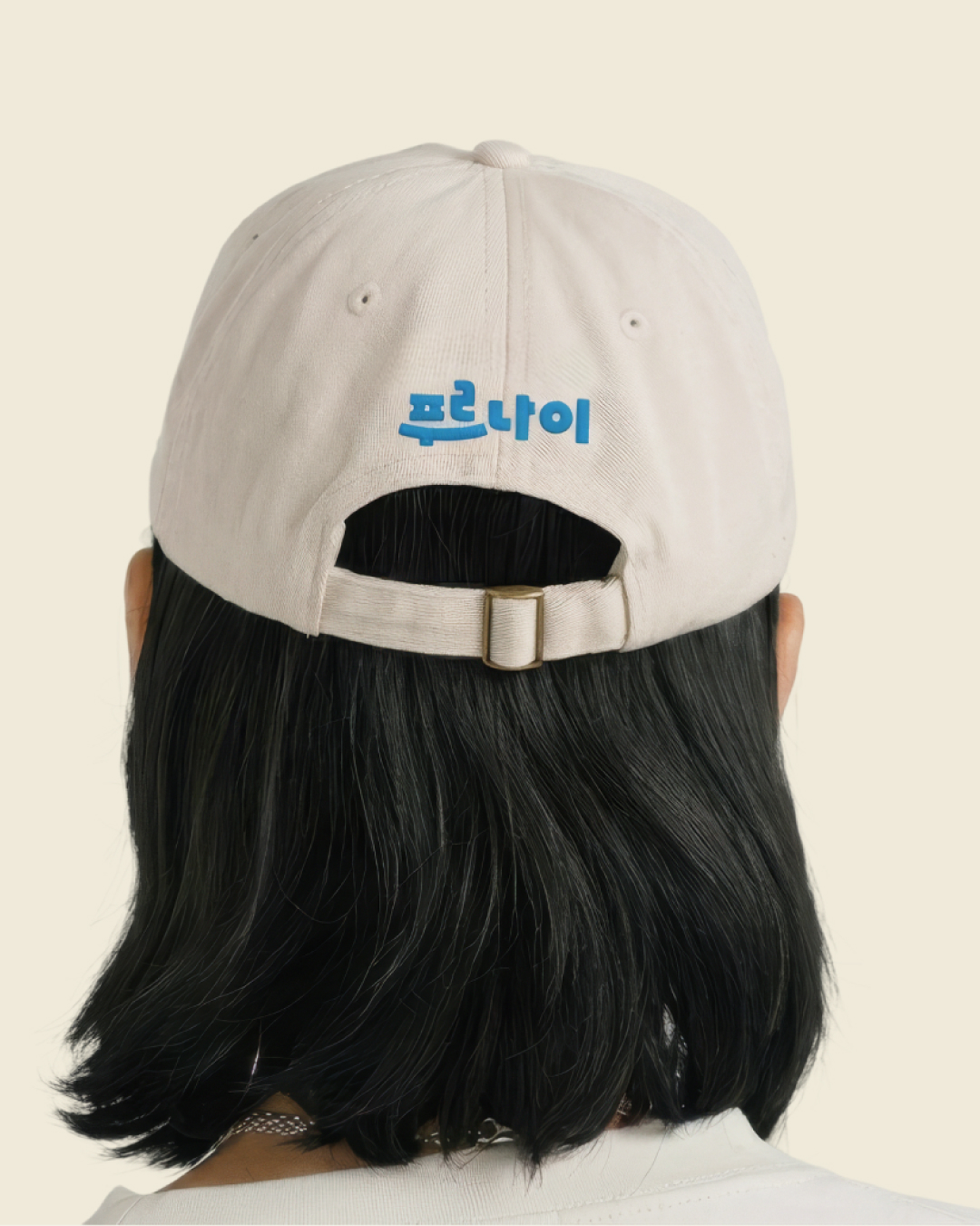
로고의 변화는 패키지와 포장재, 배송 박스와 차량, 유니폼, 디지털 콘텐츠까지 이어집니다. 서로 다른 접점에서도 같은 브랜드로 인식될 수 있도록 색상과 그래픽의 사용 원칙을 정리했습니다. 소박한 먹거리 브랜드의 인상을 넘어, 친근함과 전문성을 함께 갖춘 푸르나이의 새로운 아이덴티티입니다.
Prunai. Honest food for growing children.
For more than 30 years, Woorimil has upheld a commitment to honest ingredients. Building on that trust, Prunai is evolving into an independent clean-label brand rooted in Korean-grown ingredients. This rebrand translates that established trust into a visual language that resonates with today's consumers.
The previous logo communicated wholesome food through green nature-inspired motifs and angular lettering. Yet these familiar category cues and somewhat unrefined forms left little room for Prunai's own personality. Rather than repeating conventional symbols of natural food, we focused on whom the brand serves and the care behind its products.
At the heart of the new identity is the care of an adult who embraces and protects a child: an uncompromising commitment, from ingredients to production, to helping children grow up healthy. The new logo expresses this attitude through a smile and an embrace. Refined letter proportions and spacing, gentle curves, and substantial strokes create an identity that feels approachable to children and reassuring to parents.
We moved beyond conventional green to a vivid blue inspired by the sky above a wheat field. Representing honest production and clear, dependable values, the blue is paired with bright, warm supporting colors. Graphics drawn from wheat swaying in the breeze bring a sense of healthy vitality.
The transformation extends across packaging, shipping boxes and vehicles, uniforms, and digital content. Consistent principles for color and graphics connect these different touchpoints. The result is a distinctive identity that brings warmth and professionalism together, carrying Prunai beyond the impression of a modest food brand.